Best Types of Animation Styles (and Their Marketing Uses)
30/10/24
Author: Florencia Corazza
40 min reading
MarketingVideo Production

As you might already know, there are many, MANY different animation styles out there, each of them bringing something unique to the table. For that reason, there’s a world of possibilities when it comes to leveraging animation to communicate with your audience.
However, the challenge arrives when you have to decide between the different cartoon styles and select the one you’re going to use for your specific marketing purposes. Luckily for you, our explainer video company has put together this guide, in which you’ll find an extensive collection of 35 different animation types, along with great examples and ideas on how you could use each of them for your business.
Let me walk you through all of your options! 😃
Or if you’d like a quick rundown of the most popular animated explainer video styles, you can watch this cool video we made about it!
Table of Contents
Best Types of Animation Styles 2024
If you’re looking for in-depth information about the different cartoon styles you can leverage in your next video, then get ready to go over this awesome list:
1. 2D Animation Style
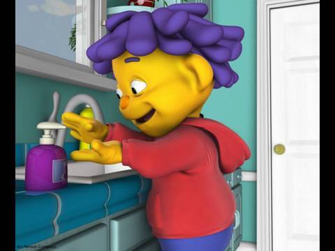
2D animation is one of the most popular and widely used types of animation in marketing. Here, animators use computers equipped with special software to create moving characters and scenes in a two-dimensional, flat space.
This speeds up the production process considerably, which is why 2D is a cost-effective option that all kinds of businesses love. But the animation pricing is not the only reason why this style is so popular. 2D videos are also highly versatile, as they allow a high level of customization that can help build an appealing and emotion-evoking piece.
2D visuals are particularly good for simple storytelling scripts, and they offer an easy and simple way to quickly turn your message and ideas into marketing videos and animated ads that get you and your business the results you want.
If you’re looking for a 2D animation studio, you can check our list with the top options out there.
2. 3D Animation Style
You’d usually find the 3D animation type in —you guessed it— animated movies under the name of GGI (Computer Generated Imagery), but it’s also the go-to choice for marketers and brands looking for that state-of-the-art, high-quality finish.
This style’s particular aesthetic provides an immersive experience, as the animation can rotate around or zoom into the graphics for a clearer understanding of how something works. For that reason, it’s widely used in the healthcare, engineering, and construction industries, where accurate representations and a high level of detail are essential.
While 3D can certainly be leveraged for the usual marketing and commercial purposes, it’s an expensive style that has a longer animation process than usual. So, 3D animation might not be the best choice where budget or time are a concern.
3. 2.5D Animation
2.5D animation is the perfect solution when you don’t have the time or the resources to make an entire video in the 3D style. How? Well, to put it simply, 2.5D stands in between 2D and 3D animation, as it combines 2D objects in a 3D space to create the illusion of a full 3D scene.
Animators implement different techniques such as shadowing, layering, and perspective adjustments to add volume to a 2D character or object and completely change the way it looks.
The resulting piece boasts a cool effect that makes every element in your video look like they’re in 3D. This cartoon style is particularly useful when looking to create more visually engaging content while staying on a budget.
4. Motion Graphics
Another type of animation style that’s in high demand is motion graphics, which involves the creation of graphics and their animation to tell a story. These elements will then be combined with charts, text, sound, and narration to communicate complex written information and hard data in a compelling and clear way.
There are many different motion graphics trends that can be used in a diverse range of industries and for a wide variety of purposes. You can take a look at some of them in our blog post about motion graphics examples.
Do you know what’s the reason for this flexibility? Simple. It’s an easy medium through which to connect with the viewer and add depth to the storytelling while conveying a brand’s message.
5. Typography Animation Type
Typography animation is a subtype of motion graphics, and it can also be found under the name of “kinetic typography.” This style is all about bringing words to life by adding visual effects and movement to the letters, and stretching, twisting, or distorting them.
That way, the text can act as an individual element or even move in the context of another element in the video. But either way, the ultimate goal is to enhance the script and provide impactful results.
In marketing, this type of animation style is typically used to convey statistical data or survey findings while engaging the viewer, something that’s only possible due to how entertaining and incredibly satisfying it is to watch.
6. Traditional Animation
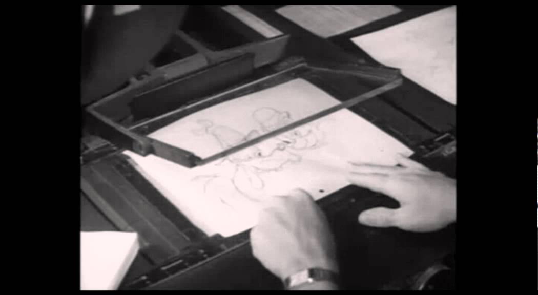
Traditional animation, often referred to as cel animation or the hand-drawn style, is the process of meticulously crafting each frame of a film by hand. This approach was the standard for creating animated movies before the rise of digital technology. Think of iconic early Disney films like Snow White and the Seven Dwarfs or Bambi—in those days, animators would illustrate every detail on transparent plastic sheets known as “cels.” These sheets were then photographed frame by frame, creating the illusion of motion when played in sequence.
Despite being both labor-intensive and costly, cel animation remains a cherished method even in modern times, often adding a unique and personal aesthetic that stands out from fully digital styles. Today, artists may still draw characters by hand, but with the advantage of digital tools for coloring and animating, allowing for a more efficient yet visually rich production process. This blend of traditional artistry with digital enhancements helps retain the charm of hand-drawn animation while accommodating faster workflows.
Traditional animation can be a great idea for any marketing video that’s character-based and that aims at building empathy and increasing engagement.
7. Whiteboard Animation
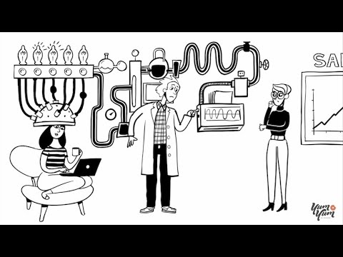
If you like the look of traditional animation, but would like to skip the painstaking process of hand-drawing every little detail in your video, then I have the perfect alternative for you: whiteboard animation. This type of animation style makes it look like the video’s content is being hand-drawn on a whiteboard.
Whiteboard animation allows you to create wonderful visuals with simple animation. Moreover, the graphics are so rich and easy to understand, that they offer a great opportunity to communicate complex information in a straightforward way.
This low-cost option is a favorite among non-profit organizations, small businesses and startups, and anyone on a budget that wants to capture their viewer’s attention through compelling storytelling.
8. Rotoscope Animation Type
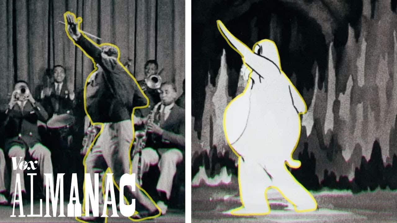
This animation style has strong ties to live-action footage, thanks to an inventive technique developed in 1915. In those early days, artists would project live-action film onto a glass panel known as a rotoscope and then carefully trace each frame, capturing the subtle movements of real people. This allowed for a lifelike fluidity in animation that was challenging to achieve purely by hand.
Since then, rotoscope animation has transformed significantly. Today, specialized software handles much of the work, streamlining the animation process and giving characters even smoother, more natural motion. This modern approach to rotoscoping keeps the essence of the original technique while enabling a faster, more flexible way to bring realistic movements to animated characters.
You can usually find this technique in crowd scenes in movies and in commercials where the animated character or object has to interact with the environment as a real character would. Moreover, rotoscoping helps reduce the cost of 3D production significantly because it makes object duplication easier.
9. Stop-Motion Animation Style
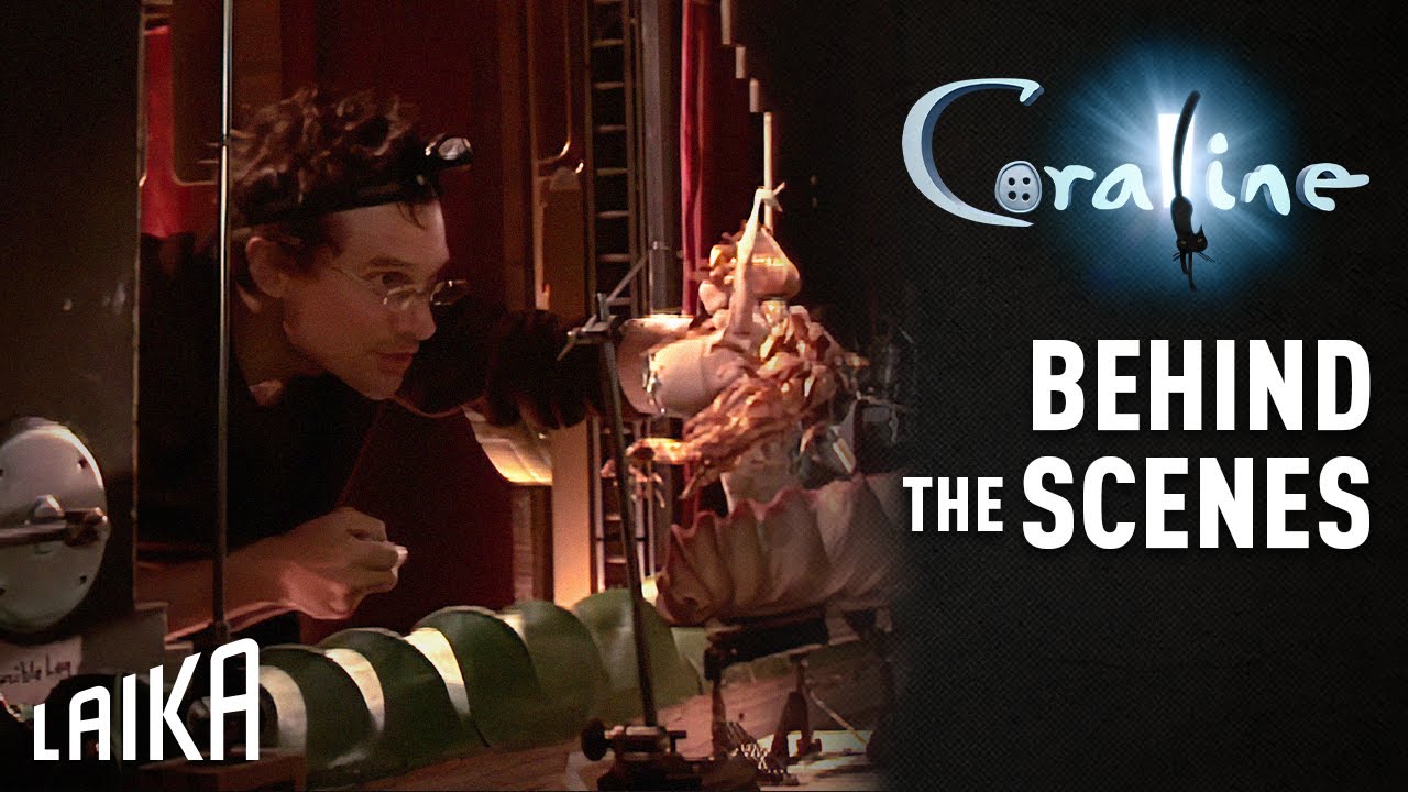
Stop-motion animation, much like traditional hand-drawn animation, is a long-established technique in the animation world. However, instead of using drawings, stop-motion brings physical objects to life by creating the illusion of movement frame by frame.
In this process, each object is carefully adjusted in tiny increments, with a photograph taken after every slight movement. It’s as meticulous as it sounds, demanding close attention to even the smallest details. Yet, when these frames are played back in rapid succession, the result is magical: the objects appear to move autonomously, as if they’re alive. This labor-intensive technique remains popular for its distinctive look and the tangible, handcrafted feel it adds to a film.
The resulting video has a special tactile feel that’s quite hard to recreate by digital means, which is why stop-motion animation has survived this long. Moreover, is an incredibly versatile technique that allows you to bring real-life products to life and create narratives around them.
10. Clay Animation
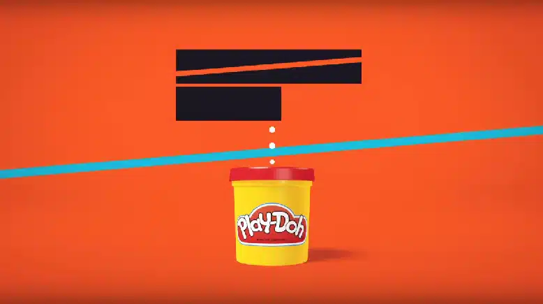
Clay animation, commonly known as Claymation, is a captivating form of stop-motion animation that uses flexible materials like plasticine clay to sculpt and shape each character or object. In this technique, every piece is photographed in small, incremental movements, similar to traditional stop-motion, to create the illusion of motion.
Despite some considering it an outdated syle, claymation remains beloved for its distinct aesthetic and the sense of nostalgia it brings. The hand-molded objects often bear subtle imperfections, lending a charm and authenticity that digital techniques can’t easily replicate. These minor variations, crafted by human touch, add a layer of warmth and personality to the final product that resonates deeply with audiences.
This style can work for younger audiences and when you want to inject your videos with a warm and comforting feel and give them a unique look. If you don’t have the time to make the model manually, there are digital modeling techniques that can help you create that claymation feel.
11. Cut-Out Animation
Cut-out animation has its roots in the stop-motion family, tracing back to the 18th century when shadow theaters entertained audiences with storytelling through silhouettes. This type of animation style, like other forms of stop-motion, is labor-intensive, requiring characters and objects to be crafted from materials like paper or cardboard. These cut-out pieces are then layered and adjusted frame by frame to simulate movement.
Cut-out animation is perfect for narrative-based marketing videos that require a more simplistic animation types. However, it’s important to bear in mind that the style won’t boast a high-end finish, which is why is not really suited for tech companies, for example.
12. Screencast Animation
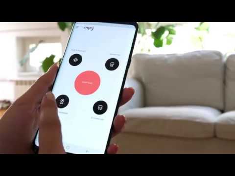
Screencast animation is an ideal approach for demonstrating how digital services or software work to potential customers. This straightforward yet powerful style transforms screen captures into engaging instructional or informative videos, making complex features easy to understand and apply.
Usually, screencast videos are enhanced with narration and text overlays, which clarify what’s happening on-screen and guide viewers step-by-step. By combining visuals with clear explanations, this method provides a hands-on, interactive feel that makes tutorials both accessible and practical for audiences, boosting their confidence and understanding of the product.
While it’s true that they can simply read a manual or set of instructions to learn the same thing, actually seeing something in use can have a powerful impact on conversion rates.
13. Mechanical Animation
You can often find videos employing this technique in businesses specializing in the manufacture of technical equipment, like those in the aerospace, automotive, food, and healthcare industries.
However, this doesn’t mean you can’t leverage mechanical animation to showcase the industrial process of any manufactured item! If your marketing goal is to break down the technology of your latest innovation or show off the smaller details of your product, it can be your greatest ally.
14. Isometric Animation Type
If you want something a bit simpler than mechanical animation, you can opt for the isometric animation style, which seeks to represent a 3D element like an object, a room, or even a building in two dimensions. While this might sound like your regular 2D animation, the goal of the isometric view is to prevent any kind of distortion.
The way that can be achieved is by designing the objects so it seems like you’re looking at them from above and from one corner. For this reason, videos in this style can be used to reveal internal parts of a product that would be otherwise hard to notice.
The architecture and technical engineering industries are quite fond of isometric animation because it helps them clearly visualize individual parts, objects, or projects. You could, for example, explain the different facilities in a building or the mechanisms of a machine in detail without it looking chaotic or messy.
15. Augmented Reality Animation
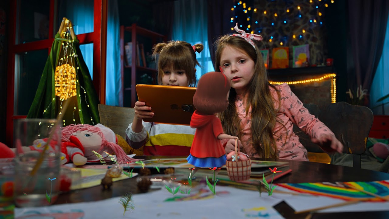
Combining live footage with digital objects and augmented reality (AR) effects takes animation into the realm of enhanced digital experiences. While AR is widely used in game development, it has also become a popular feature in social media, where it appears as interactive photo effects and filters.
That’s right—even something as simple as adding cat ears or a new hairstyle to a selfie is a form of AR animation. This technology overlays digital elements onto real-world images, creating a dynamic blend of reality and imagination. By bringing animation into everyday moments, this animation type has transformed how we engage with digital media, making it playful, interactive, and visually captivating.
In the marketing world, this animation style can be implemented to create virtual fitting rooms for eCommerce and retail, for example. It’s also popular among furniture brands because it allows them to show customers how something will fit their homes.
Families with kids love this type of animation as well because, within children’s books, characters can jump out from the page —quite literally! The best part of using AR in marketing campaigns for children’s and family brands is that any cartoon drawing style can become a wonderful and enriching experience for your audience.
16. 360° Animation
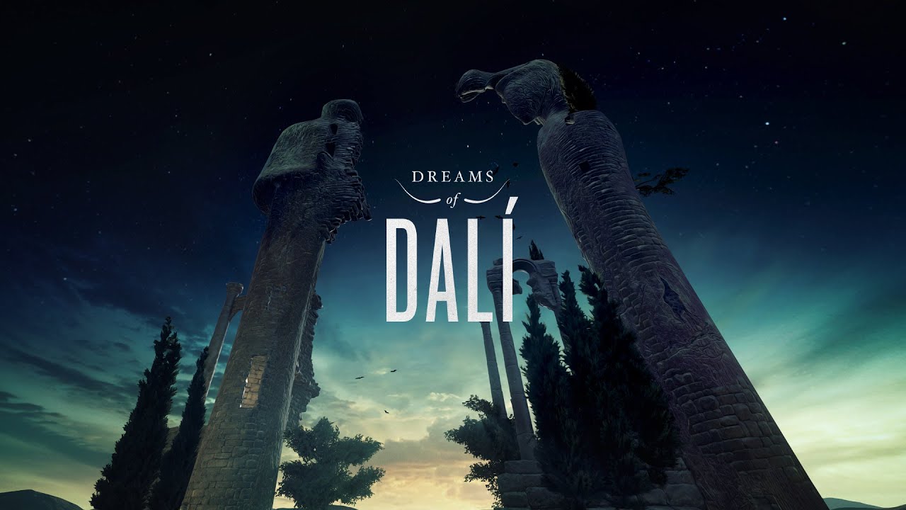
Similar to AR, 360° animation has gained popularity among clothing and furniture retailers as an advanced form of digital display. While some consider it close to 3D animation, 360° animation takes things a step further by allowing viewers to explore an object from every angle, offering a full view of its entire circumference.
This animation style is highly interactive, often featuring “hotspots” or clickable areas that provide extra information about specific details. Although it differs from traditional cartoon animation styles typically seen in marketing, 360° animation opens up endless creative possibilities. It immerses audiences in a more hands-on experience, making it perfect for showcasing products in a way that feels tangible and engaging.
Are you a homebuilder looking to give your clients a virtual tour of your building or house blueprints? Or maybe you’re a manager who needs to train new staff remotely? Perhaps you just want to give your audience an unforgettable experience… Whatever your goal is, there’s no denying that the 360° animation type allows you to create animated worlds and spaces that people can truly become a part of.
17. HUD Animation
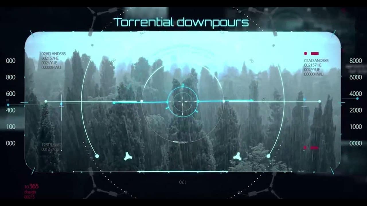
HUD, or “Head-Up Display,” is an animated style that many avid gamers recognize. Commonly found in video games, HUD animation provides players with crucial information and guidance through a visually engaging interface that doesn’t divert their attention from gameplay. Typically, it features a transparent background and a sleek, futuristic design that seamlessly integrates into the gaming environment.
Even if you’re not a gamer, you may have encountered HUD animation in science fiction films, where characters interact with data displayed on transparent screens. A prime example is the Iron Man series, where the protagonist visualizes complex information through an advanced interface. This innovative approach not only enhances the viewer’s experience but also adds a high-tech flair that captivates audiences.
In marketing and advertising, HUD is not as popular as the 2D animation styles, but it can sometimes be found in videos that address futuristic or high-tech products or services.
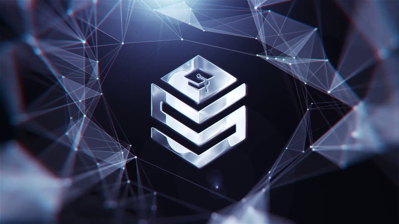
18. Plexus Animation
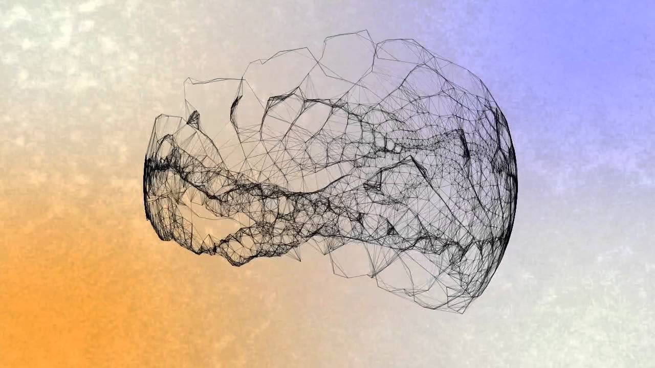
In straightforward terms, plexus animation revolves around linking dots and lines to create a flat object or figure. This type of animation blends elements of motion graphics and HUD animation, producing captivating patterns that exude a futuristic aesthetic. To truly grasp its unique appeal and differentiate it from other animation styles, seeing an example can be much more enlightening. Let’s take a look at a cool example to understand what this is about and what makes it different from other animation styles:
Now that it’s more clear what plexus animation looks like, you should know that just like those two styles I’ve mentioned, this one is vastly used in movie or game intros or credits —but this doesn’t mean it can’t be used in other industries!
For instance, it could be leveraged by security and analytical companies that need to show specific data to communicate a particular fact or by a medical professional who needs to show how a certain body system is interconnected with other systems.
The key is to be creative because even if you don’t deal with high-tech information, you could use plexus animation for a logo reveal!
19. Minimalistic Animation
So far, we’ve seen different animation styles of various degrees of complexity, but minimalistic animation, as the name suggests, stands as the simplest of them all.
This approach aims at maximum simplicity and clarity by removing all the flair other styles are known for and keeping just the necessary images and animations to convey your message.
While this animation type might seem easy to make, the challenge lies in coming up with exciting and, most importantly, effective ways to communicate your value proposition while keeping things simple.
Minimalistic animation can be found in explainer videos for online services, apps, software, and other complex services or products that require clean visuals without any of the visual clutter that would otherwise make the viewer feel bombarded.
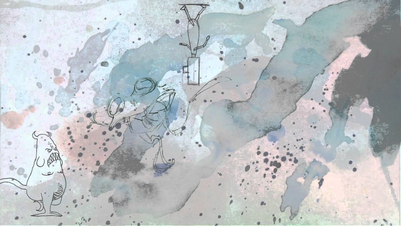
20. Experimental Animation
Experimental animation is a bit hard to define, as it’s not merely a set of sequential images combined together to create movement, but actually an art form that strives to challenge our perception and emotions.
In fact, this style has been compared to modern art because the viewer will interpret their own meaning and experience unique emotions that might be completely different from someone else’s.
Unlike traditional animation, experimental videos are an animation type that won’t impress you with excellent storytelling because it’s something it actually lacks. This approach has no narration at all, no comprehensive story, and no particular structure. Instead, the animator tries to create a completely new world, unlike anything we’ve ever seen before.
It will certainly be no easy to chore to find applications of this style in marketing, but I can tell you that if you do come up with ways to incorporate it into your existing strategy, you’ll blow your audience’s minds.
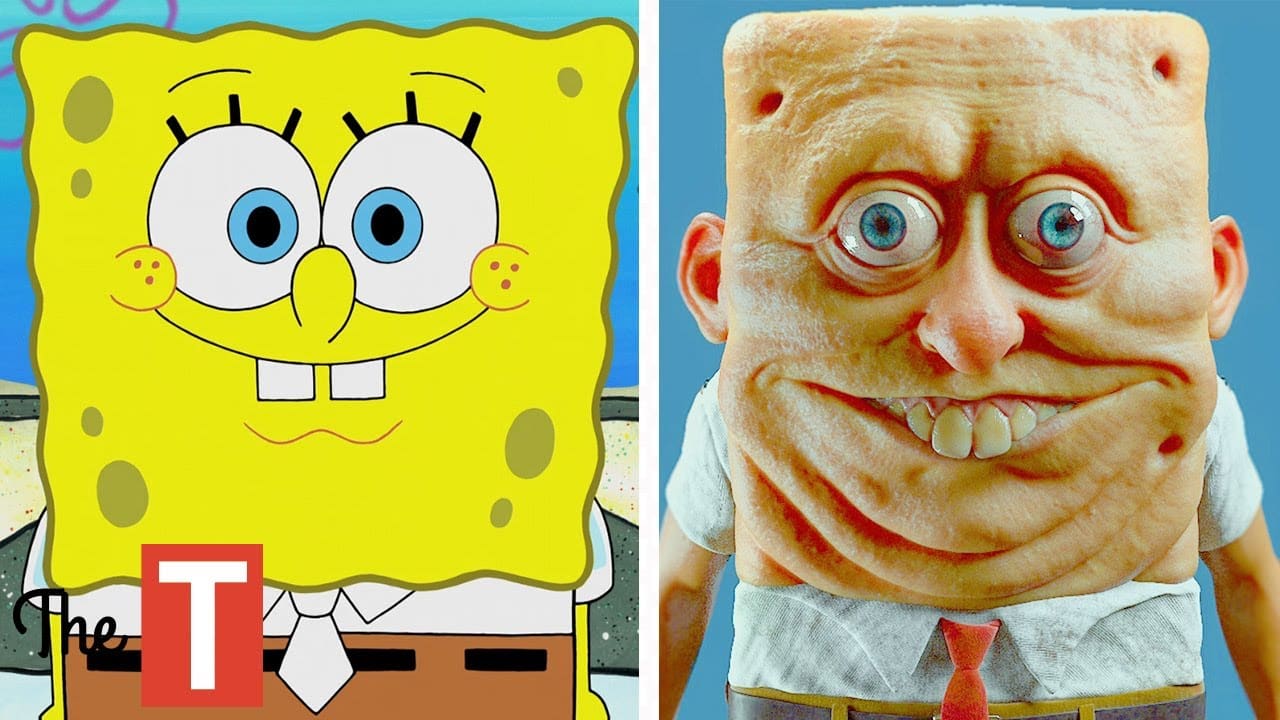
21. Realistic Cartoon Style
The realistic cartoon style challenges animators to reimagine what a cartoon character would look like in the real world, or what a real character would look like in a cartoon environment. It’s a fun experiment that can yield all kinds of results, from beautiful works of art to things straight out of your worst nightmare (looking at you, realistic SpongeBob and Patrick 😑).
Developing a video in this style requires a lot of skill and creativity, but it can be useful to engage a broad range of audiences, from little kids who’d like to see their favorite characters come alive, or adults looking for more “mature-looking” cartoons.
22. Japanese Classic Manga
Mangas are Japanese comics or graphic novels that have recently found new life through 2D animation technology. It’s important to note that this style differs from anime; classic manga animation features more rigid character movements, less fluid transitions, and a “rougher” aesthetic that mirrors the original manga art style.
While traditional manga animation is typically rendered in black and white, the use of color has become increasingly accepted, adding a modern twist. This approach captures the essence of the manga while providing a dynamic viewing experience, appealing to both long-time fans and newcomers alike.
This style is intended for a very specific audience that will know to appreciate its particular look. That’s why it can be a great idea to employ it in videos for international brands looking to expand their businesses to Japan, for example.
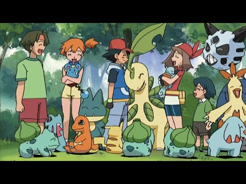
23. Anime
Now, unless you’ve been living under a rock for over a decade, you must know what anime is. Basically, it’s an animation type refers to animations produced in Japan, which are characterized by particular cartoon drawing styles.
While some animators prefer to use realistic characters, the most popular anime trend is to wildly exaggerate certain features of them. If you pay attention, you’ll find that the most common feature in anime characters is their oversized and expressive eyes. But you’ll also come across unrealistically bright hair colors and crazy body proportions to convey a specific age, status, or personality trait.
Unlike traditional cartoon animation styles produced in the rest of the world, Japanese anime is frequently geared toward adult and young-adult viewers, which is why the storylines usually feature controversial or complex topics. Despite that, there’s still plenty of anime content for children! This means you can harness this style regardless of the demographic your campaign is designed to target.
24. Motion Comic
Motion comics are simply animated digital comics. In most cases, animators take the original comic as the starting point and add animation elements to make the story flow. You might also find them online as “Flash comics” because of the use of Adobe Flash to animate them, or as “vomics” (voiced comics), as they’re known in Japan.
Some motion comics include speech bubbles and others have either music or professional voice-acting, but there are no set rules. What to do regarding this aspect of comics is entirely up to the animator and the audience’s preferences.
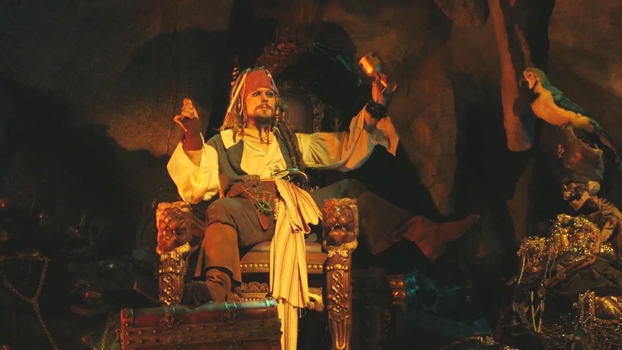
25. Autonomatronics and Audio-Animatronics
If you know what animatronics are, you’re probably thinking it’s quite out of place among these animation styles. However, the term was born from the combination of the words “animation” and “electronics,” and it refers to the technique of electronically animating 3D characters, either for their use in movies or at museums and theme park attractions.
“Audio-Animatronics,” on the other hand, is the registered trademark name for a form of robotics that Walt Disney Imagineering created for their shows and theme parks. The mechanical figures are synchronized with an audio soundtrack that gives the illusion of the robots moving and making noise or singing. However, they’re fixed to their support, and while they can sit and stand, they usually can’t walk or respond to external stimuli.
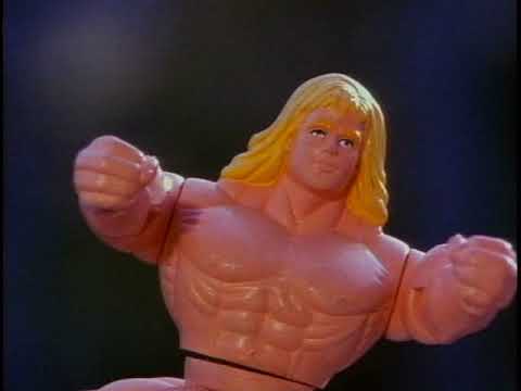
26. Chuckimation
Chuckimation is a peculiar type of animation in which the characters are real-world objects which are thrown or chucked to simulate movement. They’re also wiggled around to make it look like they’re talking.
This combination of stop-frame animation and live-action shots was created by the producers of a cartoon called “Action League Now,” but it’s not so widespread at present so using it in video marketing can be tricky.
Off the top of my head, I might suggest kid’s toy companies could benefit from chuckimation. For example, they could launch a contest for kids to create a very short story with their toys, record it, and send it. Then, the winner could get their story shared on the company’s social media. This way, the brand could build a deeper connection with the target audience, entertain them, and gain good promotion at the same time.
27. Puppetry Animation Type
Puppetry Animation was born in 1906 when a Russian ballet choreographer called Aleksandr Shiryaev made the very first puppet animation film. It involved papier-mâché figures that danced ballet against a still background of theatrical decorations.
Like with traditional animation and stop-motion, making a puppetry animation video is a labor-intensive process that required incredible precision. Especially when you consider the times when an entire group of characters required simultaneous movement!
Nowadays, this style borders the line between puppet theater and 2D, or even 3D animation, with the introduction of puppet characters into a digital world.
As for marketing applications… well, it’s another style you could use to make cartoons with creative storytelling for different audiences, whether they’re made up of children or adults.
28. Flipbook Animation Style
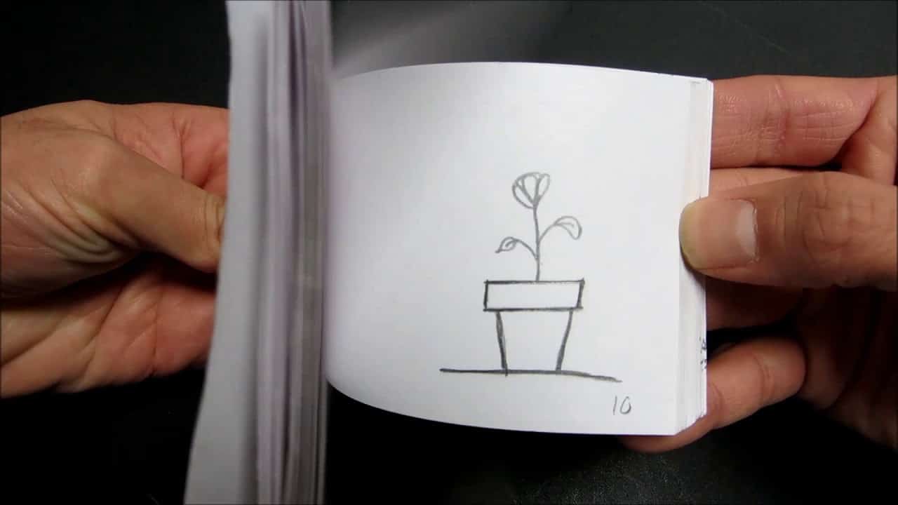
Flipbook animation is a simple yet fun technique to bring very short stories to life. I’m sure you’ve seen (and maybe even made!) one of these before. Here, a scene is broken down into several illustrations that are hand-drawn onto the pages of a flipbook that’s rapidly flicked through to create a moving picture.
This is probably the most basic way to make an animation, as flipbooks are typically 15 seconds long. But hey, I hear there’s a social media platform in which that kind of video is particularly popular 😉.
The truth is that this medium is not really that effective in marketing, unless, of course, you’re looking for a creative way to entertain your prospects.
29. Zoetrope Animation
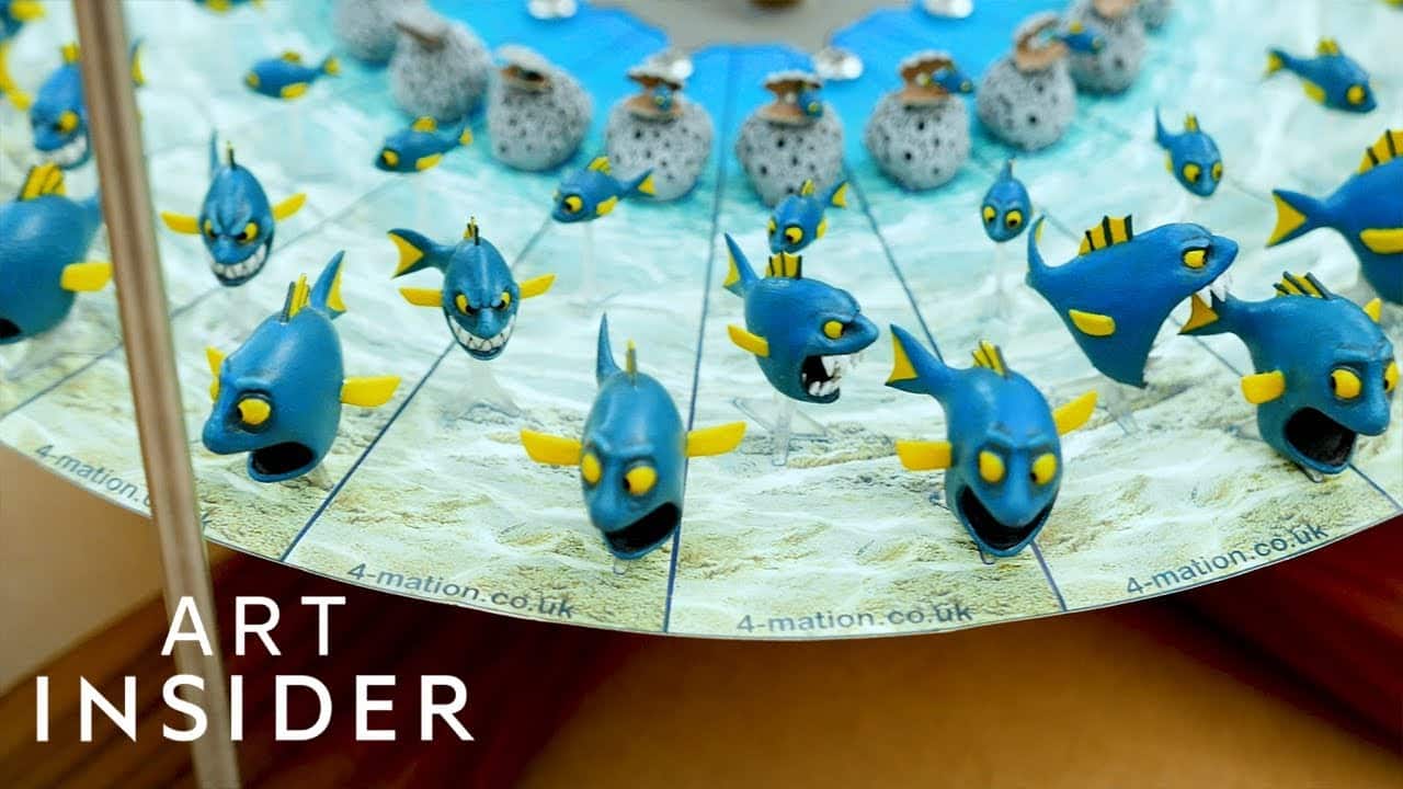
This is probably the oldest style of animation, with the first record of it in use dating back to 180 BC 😱. The name “zeotrope animation” comes from the special tool required to give movement to the characters… a zeotrope.
If you’ve never seen one before, just imagine a drum without a cover and with vertical cuts on the sides. If you look through the cuts, you’d see a ribbon with drawings that, as the drum spins, would show a rapid succession of images that form a short animation.
This style is not really seen in marketing because it requires an actual zoetrope, but it’s still worth mentioning as you can find it at museums and theme park attractions
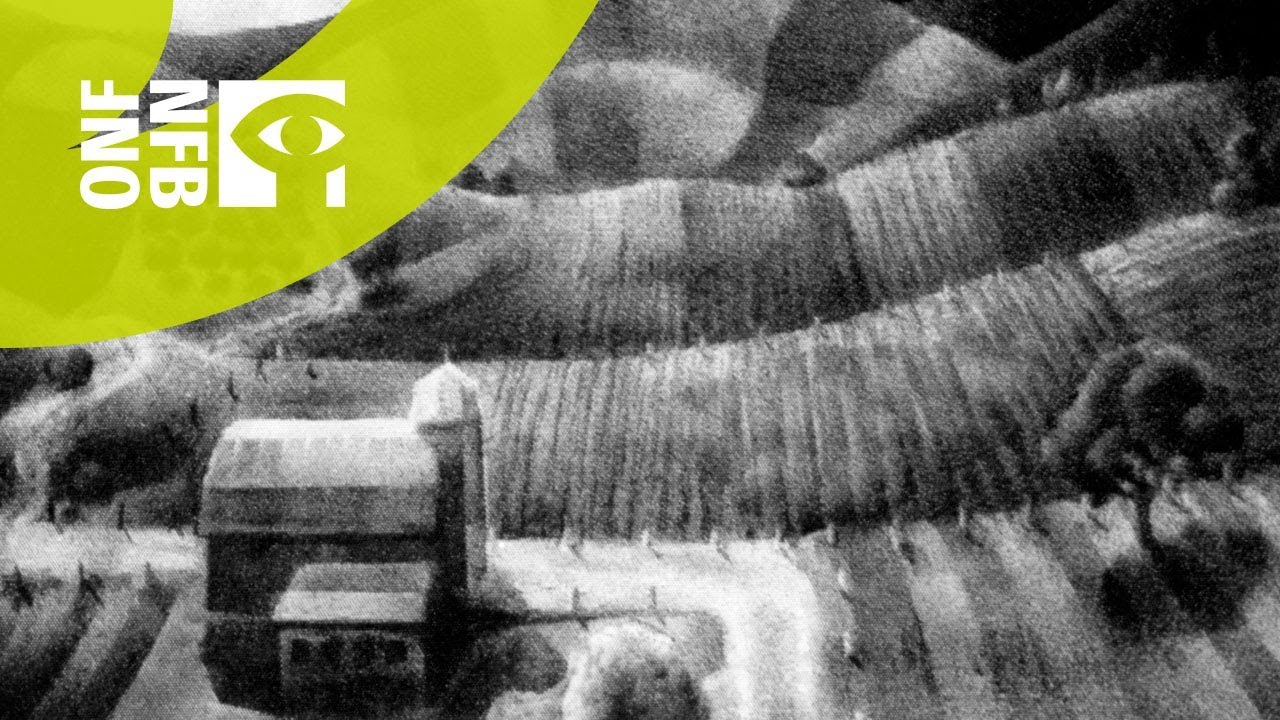
30. Pinscreen Animation
This is one of my favorite styles because of how creative and unusual it is. To make a pinscreen animation, you’ll need a board and thousands of metal pins or needles. No, I’m not lying. As the needles are pushed through the board, they can copy the shape of an object. Then, the screen is lit from one side so that the needles cast shadows and create an image.
Pinscreen animation is considered to be the predecessor of computer graphics, with each needle being a pixel of a computer monitor. Pretty cool, don’t you think?
While this style is not particularly useful in marketing, it can help you create distinctive and mesmerizing animations with an otherworldly look and feel.
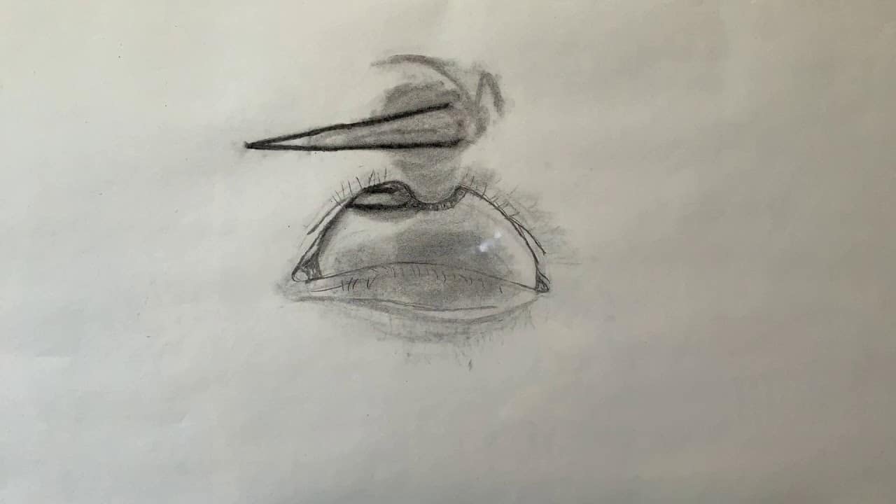
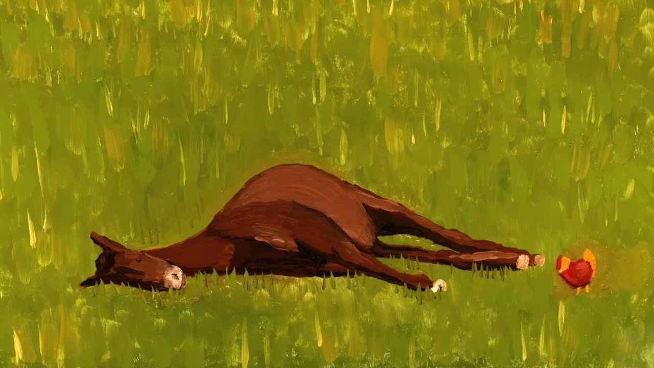
31. Erasure Animation Style
A simpler style that only requires white paper, a pencil or a piece of charcoal, and an eraser to create a story, erasure animation offers an alternative for animators to give their creativity free rein without fear of making mistakes.
What sets erasure animation apart is its intentional imperfections. Instead of striving for a clean, polished look, artists often use the same sheet of paper throughout the animation process, allowing for smudges and marks to become integral features of the style. This raw and organic approach adds a unique charm, emphasizing the fluidity of creativity and the beauty of the artistic journey.
Leveraging this technique can be an interesting addition to your strategy. If you don’t want to make it by hand, I’m sure it could be recreated digitally.
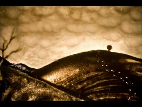
32. Sand Animation
While the execution of this technique is rather complicated, there are some marketing situations in which it could be used. For example, you could showcase the history of a certain product and its evolution through time.
33. Paint-on-Glass Animation Type
Like any work of art, paint-on-glass is a complex animation technique that calls for efficient artistic skills, as each frame comes to life right in front of the camera and only lasts for a fraction of a second before the next frame takes its place.
The animator uses slow-drying paints to create the scene on a glass canvas, which doesn’t really sound that difficult. The challenge comes when they have to manipulate the painting and photograph them at the same time. For that reason, they often used turpentine to make the paints easier to work with.
This impressionist style, while wonderful to watch, is unfortunately not very popular due to the high level of skill it demands from the artists.
34. Drawn-on-film Animation
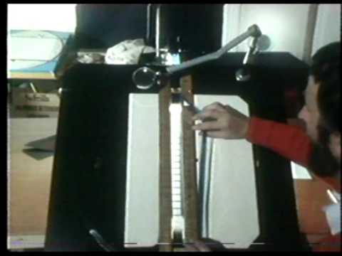
Another fun yet kind of outdated style is drawn-on-film, which requires manipulating an exposed film reel. There are a few different techniques that can be employed, such as punching holes into the film, scratching and etching it, or introducing light variations in the darkroom to permanently embed shadows on it.
Drawn-on-film dates from around 1916 but, unfortunately, most of those animations have been lost. However, enough survived to know that the animators worked with either developed or undeveloped of all sizes, although larger sizes were preferred since they were easier to work on.
One of the perks of this style is that no cameras are required, making it one of the cheapest around. Though you’d certainly need a projector to see the final animation. And while you might not be able to use it for marketing purposes, it’s still interesting to learn how it worked.
35. Live-Action Blending
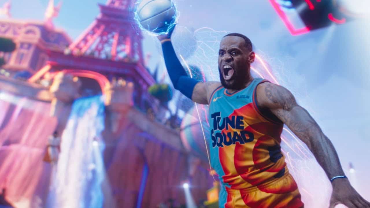
Finally, we have videos that combine animation with live-action footage and that tend to showcase characters and objects in both styles interacting with each other. You can have cartoon characters in live-action shots or real actors in animated footage. The Space Jam movies are an excellent example of the blending of both styles.
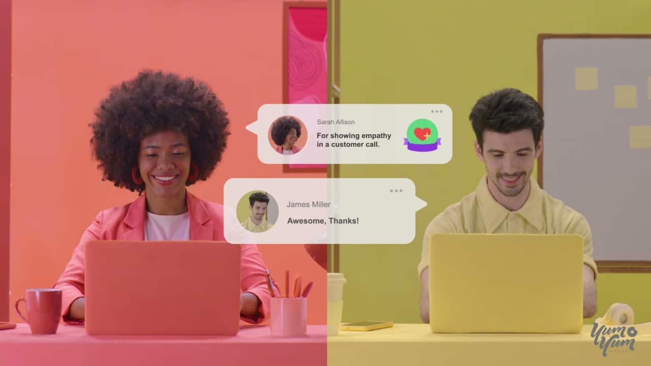
This hybrid style is quite popular in marketing because the human component, brought to life by expert live-action video production, makes the message more relatable, whereas the animated elements make it easier to understand and more interesting to watch.
Best Practices to Make an Animation Video Regardless of the Type of Animation
Understanding the different animation styles available—and having the best creative examples to gain some inspiration from—is a great way to start developing an animation video to boost your marketing efforts. However, that’s not all there is to it!
When it comes to quality video production, there are some best practices you need to follow, no matter the style. Failure to do so may end up in a waste of resources, an inability to meet the projected deadline, or worse—an attractive video that simply couldn’t meet the objective because it was made with the wrong audience in mind.
To help you prevent that, here are some animation video production best practices:
1. Understand Your Target Audience
A common mistake many brands make when creating an animation video for their brand is focusing too much on their product’s features or their brand’s positive qualities. While being proud of your company and what it has to offer is always great, it’s a mistake to think that everyone will want to hear about it—and enjoy it as much as you do.
The purpose of the video is not to impress yourself or your colleagues but to demonstrate to a potential audience how your product can be perfect to meet an unfulfilled need in their life. And the best way to do so is by keeping a clear understanding of who you’re talking to.
Before starting, take your time and get to know your audience. You can conduct research, send out a survey to your regular customers offering an attractive discount in exchange, or work tightly with the sales team to develop an accurate buyer persona—that is, an imaginary representation of your typical client.
This will allow you to tailor your messaging, visuals, and tone, choose the best among different animation styles, and create a video that resonates with your viewers.
2. Write a Script—And Follow It!
One of the most important steps in video production for all animation types is writing a script.
Scripts help guarantee that your message is succinct and clear while giving a defined structure or roadmap to help you arrange your ideas and make them flow naturally from one to the next. Using a script to create your video will make it easier for your audience to understand your main points and, consequently, your product or service.
Moreover, a well-designed script is fundamental to ensuring efficient time management. By knowing what your video will have, you can plan your content accordingly and distribute tasks between team members with ease.
Nevertheless, writing the script is just the first part: after that, you need to follow it. Don’t use your planning as a cup holder—if you took the time to design a script, pick up at least one person from the team who’s responsible for overseeing and verifying that the script is respected and that everything goes according to plan.
3. The Shorter the Better
As you may have noticed from viewing some of the animation styles’ examples on this page, animated explainer videos that deliver their message succinctly tend to be the most effective. That’s because audiences have limited attention spans—and this is especially true online. People don’t surf the Internet looking forward to watching a 30-minute video about your brand.
Shorter videos can grab the viewers’ attention and deliver the most important information before they become distracted. This makes it more likely for them to remember the key points of your message and be able to recall it at a later time—for example, when they run into your brand at the supermarket.
Moreover, giving yourself a time limit can actually help you work and filter your ideas in order to leave only the core elements. So, avoid overloading your audience with information, and focus on sending out a concise but effective message.
4. Use a Clear Voiceover
It’s easy to think of attractive visuals when you’re choosing among animation styles and planning your video, but the voiceover is actually one of the most important elements. After all, characters and design elements can help push the story forward, but the things you say are what actually narrate what’s happening.
Because of that, take your time coming up with the perfect voiceover for your video. Choose a voice that is consistent with the tone of your story, emphasizing the main ideas and feelings you wish to get across. A powerful voiceover can convey with passion, humor, sincerity, or any other desired emotion to give the audience an unforgettable experience.
What you don’t say also plays an important part. Use pauses and emphasis in the voiceover to highlight important parts of the story.
By recording a compelling voiceover for your animated video, you’ll be able to explain even the hardest, most complex concepts clearly and concisely, making it easier for the audience to understand your product—and feel tempted to buy it!
5. Don’t Forget to Add a Video CTA!
There are three main goals you should focus on when creating an explainer video:
One, it must explain your product or service clearly to the viewers. Second, it must show them how you can efficiently solve their problem. Finally, it must persuade them to act. To achieve that, you need a compelling CTA.
A call to action (CTA) is a message you place at the end of your video to encourage viewers to follow a specific action. CTAs aren’t only about purchasing a product: they can urge viewers to fill out a form, share a video, or even follow your brand on social media.
Whatever it is, it must be aligned with the video’s original objective and show value, that is, explain to viewers what they will gain by taking action.
Another best practice for CTAs is conducting an A/B test. This implies experimenting with different CTAs, and analyzing the performance of each one, to determine which resonates best with your audience. By testing different wordings, positioning, and visuals, you can add the best CTA, with the potential of achieving the most click-through rates, to your video.
Why Choose Yum Yum Videos for Your Animation Needs?
When it comes to producing animated videos, there are many options available, but there are certain things we strongly believe set us apart from other alternatives. To begin with, we’re completely dedicated to achieving our objectives and surpassing our client’s expectations—and our history of happy clients can attest to that! Just take a look at what some of them have to say about working with us:
But that’s not all! You should know that we’re committed to truly understanding our client’s needs before starting the project. We’re well aware that proper planning in the pre-production process is the secret to a smooth-sailing project, after all. Your message, product, and target audience—all of these are things we want to understand to the T before starting to develop content.
We bring together professionals from every industry, including enthusiastic writers designers and producers, directors, and animators. And every one of them is a bit of a perfectionist, believing that creating effective pieces requires careful attention to detail.
Creating captivating, high-quality videos that live up to the client’s expectations is our first priority. And to do so, organization is key. We adhere to a rigorous video production process with well-defined phases, multiple quality control levels, and set deadlines. In addition, we give our clients Gantt charts so they can see our current state of work at any given time. And, regardless of the stage in the process, we are happy to hear any feedback they may have and use it to create a video we’re both happy with.
If you are searching for a company that can provide a fully customized video, in different animation styles, with the best quality, reach out! We’d love to hear more about your project and see how we can help 😉.
Frequently Asked Questions About Animation Styles
Every animated video style has advantages and disadvantages, and the best one to use will depend on the intended emotional effect, the target audience, and the message to be delivered.
By knowing these different cartoon styles and what each one has to offer, you can choose the best one to tell your story. To help you do just that, we came up with some frequently asked questions about cartoon styles.
1. What Does Video Animation Style Mean?
Animation styles refer to the various techniques and aesthetics used to create animated content with a marketing purpose, be it to sell and promote a product, or simply to make a brand’s identity and mission well-known.
Each animation type can help convey different messages and emotions, more effectively making them more suitable for different marketing purposes.
2. How Can You Know Which Animation Style to Choose?
There are several factors you need to consider when deciding which format to choose: from your target audience to the campaign objectives, and even on which platforms you’ll be displaying your content.
Still, as a rule of thumb, make sure that the animation styles and the tone of your message mesh well. Lighthearted content could benefit from character-driven or stop-motion styles, while serious topics might work better with 2D or motion graphics.
Additionally, considering your available budget and resources is fundamental. After all, some styles, like 3D animation, can be considerably more costly and time-consuming. If your budget is tight, a whiteboard animation may be quicker and more accessible to produce.
3. How Much Do These Types of Animation Styles Typically Cost?
After seeing all of these attractive marketing videos, you may now be tempted by the idea of creating an animated video for your brand. However, before starting, finding out if it fits your budget is necessary.
The cost of an animation video can vary depending on several factors, like duration, type of animation, and complexity of the project. Here’s a small guide you can keep in mind:
- Popular and adaptable, 2D animation is used in all kinds of media projects, including explainer videos, product videos, and commercial ads. It can cost as little as $5,000 per minute for simple ones and as much as $25,000 per minute for large studio productions.
- The cost of 3D animation can be higher, as this style is more complex and artistically detailed. Per minute, it ranges around $10,000 and $30,000.
- Whiteboard animation is a simpler animation style, so it tends to be more affordable. The typical price range is between $6,000 and $12,000 for each minute of animation.
- Budgeting for live actions comes with its own set of challenges, as you must consider the cost of hiring actors, creating the set, and post-editing to make everything work. If you add animation to the mix, the costs become higher. Overall, live-action mixed with animation may range from $20,000 to $200,000 per minute, but high-end projects can go significantly higher.
Not every type of video will be perfect for any project, though. So, compare these options, gauge your potential return on investment, and pick the right one for you ensuring every dollar of your budget counts.
4. How Long Does It Take to Develop a Cartoon Style Video?
The length of an animation process varies depending on a number of factors, but eight weeks is the typical time frame for completion. However, this also depends on the kind of animation, how long the video is, and the different steps involved in the animation process.
The main stages of the animation process are brainstorming, storyboarding, illustrations, sound design, scriptwriting, animation, and editing. However, each company may differ in how they choose to do things.
For example, here at Yum Yum Videos, we add regular stages for revisions with the client, to ensure that the final result is looking like what you expected. For us, this is a stage integral to the success of your animation.
5. Best Software to Create Different Animation Styles?
Video has become a popular tool for all kinds of marketing strategies and, with its growth, several video creation apps emerged, designed to make the production process easier for non-experts or companies without the budget to hire a professional animation company. Some of the best animation apps are:
- Pencil2D: This free, open-source, and user-friendly program allows you to easily create 2D animations. They offer a drag-and-drop editor and plenty of pre-setup animation layouts, making it a great tool for beginners to experiment with.
- Visme: You can create animated graphics, videos, presentations, advertisements, and more with this cloud-based design tool. You will be able to create original animated characters and captivating content thanks to more than 20 animated templates and strong, interactive features that allow you to animate text, videos, images, or slides.
- Linearity Move: This user-friendly animation tool makes creating motion graphics a walk in the park. On Mac and iPad, you can create transitions from imported graphics by using its Auto Animate feature. Additionally, you can easily edit and create seamless animations with their dual Design and Animate modes.
- FlipaClip: Despite being a little more sophisticated, this tool has a lot of amazing features. For example, it has a large sound effect library that can elevate your video to a professional level and a variety of pressure-sensitive brushes that let you add depth to your work. Additionally, the animation process is made simpler by their onion layering feature, which lets you see the layers that came before while drawing.
- Alight Motion: This design app available for iPhones, iPads, Macs, and smartphones allows you to edit videos, produce high-quality animations, and create unique motion graphics easily. You can create amazing animated advertisements with a distinctive and polished look thanks to the more than 100 basic effects available—and all from the comfort of your phone!
As you can see, you have many resources today that can help you start your marketing video production journey. Even as a beginner, many of these tools offer tutorials, detailed guides, and easy-to-use, “drag-and-drop” templates.
And if you want to develop a more personalized and effective video, reaching out to an expert video-producing company may be the solution you’re looking for.
Wrapping Up
The power of animation lies in that it’s not bound by the laws of reality, and the only limit to what you can create to engage your audience and convey your message is your own imagination.
Whether you want a fun, short clip that can become viral on social media or an explainer video to break down the basics of your product or service, there’s always an animation style that perfectly suits whatever you need to communicate (and if you don’t believe me, you can check out some product video examples!).
Some of these styles are more well-known than others, but in this guide, I’ve made sure to include all of them so you can make an informed decision. As a final piece of advice, focus on your preferences and the video’s theme, setting, and tone of the story you want to tell before you start shortlisting your options.

Florencia Corazza – Content Writer and Co-Editor
A skilled writer, translator, and co-editor for our web and blog content. As a self-defined "wordsmith," she’s talented in adapting the latest marketing news into all kinds of digital formats. If she’s not watching the latest Sci-Fi show on Netflix, then can find her tending to her perfectly reasonable number of plants.
