20 Best Promotional Video Examples for Businesses (2026 Guide)

Co-founder of Yum Yum Videos | Explainer Video & Video Marketing Expert
Promotional videos are a pretty loose category. A short software clip, a product launch from Apple, an airline commercial, and a brand film about women in sport can all qualify. Promotional videos direct attention toward a product, service, event, company, or message.
In more than 14 years producing marketing and explainer videos at Yum Yum Videos, I’ve worked on very short promos as well as longer animated pieces. Dropbox Paper introduces its idea in 16 seconds. Amazon Go needs more time because it has to show a shopping experience most people had never seen before.
These 25 promotional video examples span launches, apps, brand campaigns, software, food, travel, and retail. Amazon Appstore and Open Cinema are projects from our own team, which also gives me a chance to talk about a few production choices from the inside.

What Is a Promotional Video?
A promotional video is a video created to draw attention to a product, service, event, campaign, company, or brand message.
The label describes what the video is supposed to do. The production itself can take almost any form: live action, animation, product footage, a screencast, mixed media, or even a piece built mostly around typography.
A product launch may introduce one new feature. A brand campaign can spend its time on values or lifestyle. Event promos have practical information to communicate, while social videos often have only a few seconds to make the subject clear.
Our guide to types of video content for business covers the wider range of formats companies use. If you are looking specifically for product references, we also collected our favorite product video examples.
25 Best Promotional Video Examples to Spark Ideas for Your Business
25 Promotional Video Examples at a Glance
| Amazon Appstore | Keeps a complex product focused on a few reasons to care |
| M&S Food | Lets close ups, texture, and movement sell the food |
| Rare Beauty | Builds the video around the brand’s point of view on beauty |
| Nike | Connects a social message to a subject the brand already owns |
| Apple | Uses kinetic typography to make a launch with many features feel fast |
| Open Cinema | Turns important words into part of the animation itself |
| Penguin Random House | Makes a promo that book people might watch for the joke alone |
| Gillette | Gets straight to what changed in a familiar product |
| Emirates | Uses a migrating goose to make airline advertising less predictable |
| Samsung | Builds the whole commercial around the phone’s flip format |
| AdZerk / Kevel | Uses the limitations of familiar competitors as the setup |
| Xbox | Spends more time on the worlds players enter than on the console |
| Red Bull | Uses a lifestyle association built over years of sports marketing |
| Amazon Go | Makes an unfamiliar service easy to understand by showing the visit |
| Heinz | Gives Ed Sheeran a situation where the ketchup actually belongs |
| Chevy | Lets the emotional story develop before the car takes focus |
| Philips | Gives a broad brand promise a future people can picture |
| The North Face x Gucci | Lets the collaboration and design carry a deliberately simple promo |
| Monday | Uses the actual interface as evidence of how the software works |
| Spacetti | Organizes several app features around questions users might ask |
| Microsoft | Turns manufacturing and engineering into part of the product story |
| Starbucks | Uses its anniversary as a reason to tell a broader company story |
| Dropbox Paper | Introduces a collaboration tool in only 16 seconds |
| Okta | Gets a lot from a deliberately limited visual system |
| Workday | Mixes several production techniques without losing visual hierarchy |
25 Best Promotional Video Examples for 2026
1. Amazon Appstore: Focus the Video Promo on the Main Value Proposition
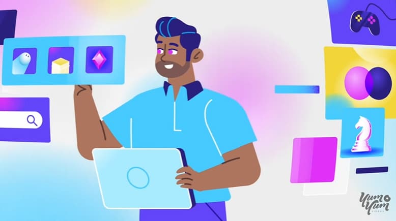
The Amazon Appstore could easily fill several minutes with features and technical detail. This promo makes a much stricter choice. It stays with the main reasons the intended viewer would care and lets the animation support those points.
We run into this decision often with apps and SaaS products. A short promotion usually cannot carry the whole product story, so the script needs a priority. With Amazon Appstore, the value proposition gets that space.
Products that genuinely require more explanation usually need a different asset or a longer version rather than squeezing another six features into the promo.
If you are looking for a production partner, our animated explainer video company works on marketing videos for products, services, and complex business ideas.
2. M&S Food: Make the Product the Visual Story
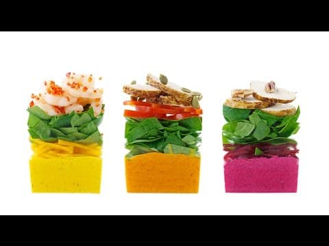
Watch this M&S video with the sound off and you would still understand why the food is there.
Close ups, texture, color, movement, and transitions do most of the selling. Captions step in when a little product information is useful, but the commercial never becomes a narrated menu.
Food has a huge advantage on video: it already gives the camera something appealing to work with. Fashion, beauty, travel, and other visual categories can often do the same.
3. Rare Beauty: Use a Brand Promotion Video to Explain the Mission

Rare Beauty spends this video on the idea behind the company. Selena Gomez talks about beauty, self image, and what she wanted the brand to represent, while footage from the team keeps the message connected to actual people.
Individual products are almost secondary. The viewer is being introduced to the relationship Rare Beauty wants to have with its audience.
That only works when the mission feels close to the product category. Here it does.
4. Nike: Build the Promo Around a Cause the Brand Already Owns
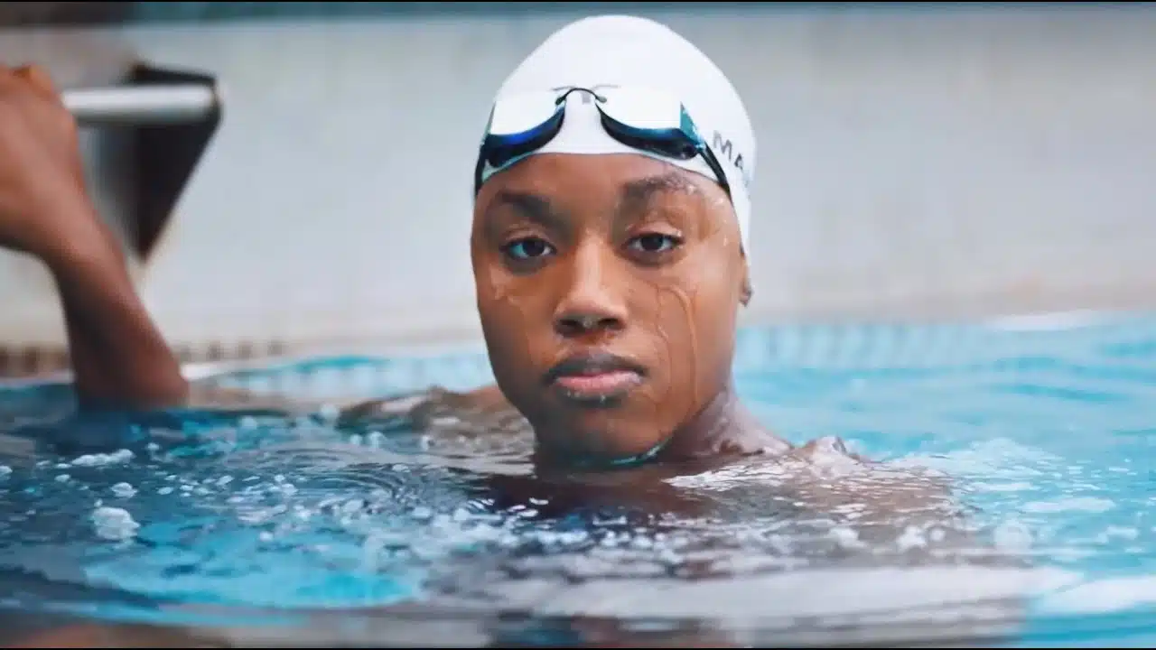
Campaigns built around a cause can feel opportunistic very quickly. Nike has an advantage here because women in sport already sit inside decades of the company’s advertising and sponsorship history.
Archival footage, current athletes, and younger girls connect different generations without needing a long explanation of Nike’s involvement. The subject already belongs naturally in the brand’s world.
5. Apple: Let Typography Carry the Product Launch
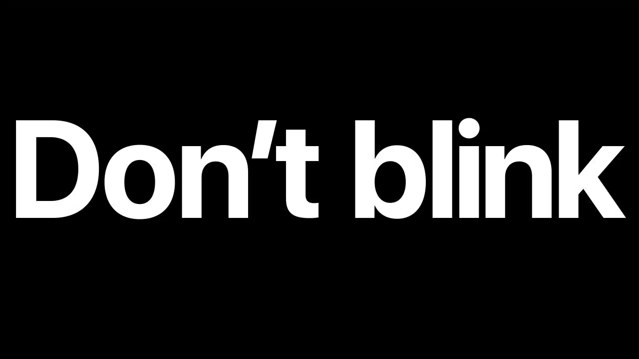
Apple’s Don’t Blink feels a little like trying to read while somebody keeps turning the page for you.
The video moves through features with kinetic typography, music, quick product shots, and aggressive pacing. Text is responsible for much of the structure: what appears, how long you have to read it, and what receives emphasis.
There is a lot of information here, yet the launch never feels like somebody reading a specification sheet aloud.
6. Open Cinema: Use Text as Part of the Animation
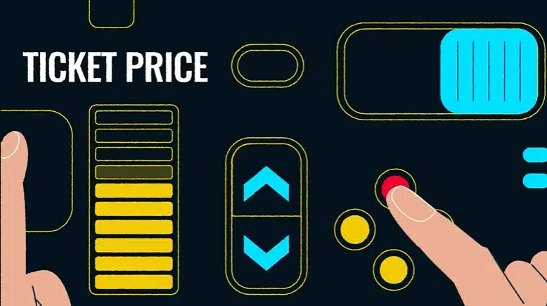
Open Cinema is one of our own animated ad projects, and the words themselves needed attention.
We made key phrases part of the visual language. They enter scenes, change scale, and interact with the animation rather than sitting quietly at the bottom of the frame.
That was useful because certain terms had to register quickly. It also gave us another way to control pace without stuffing more information into the voiceover.
7. Penguin Random House: Make a Promo Video People Would Watch Anyway
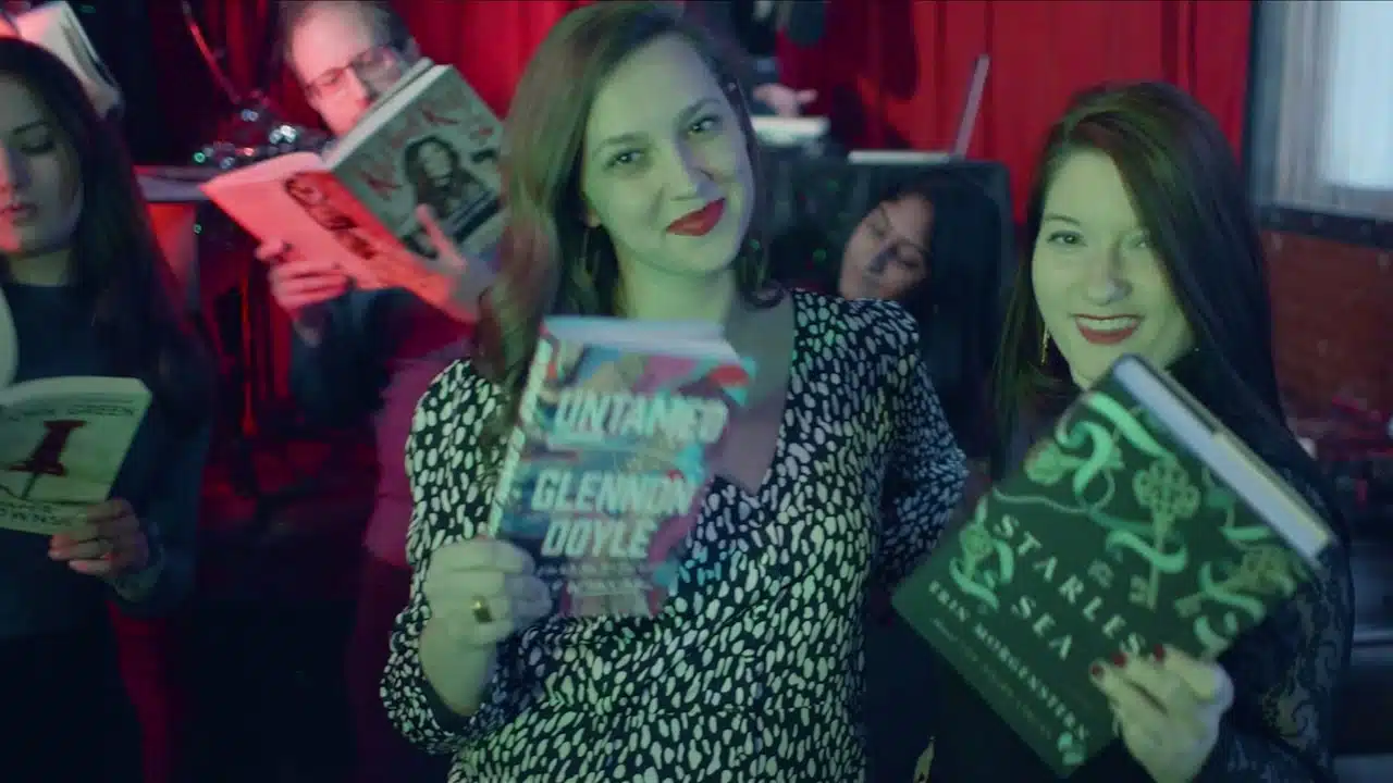
This one understands book people.
Penguin Random House invents an April Fools book club that behaves like a nightlife venue. Drink names, references, and tiny details reward anyone who is enough of a reader to get the joke.
The books and authors are still being promoted, but the audience has something to enjoy before anyone asks for attention on the product.
8. Gillette: Use the Promo to Explain What Changed
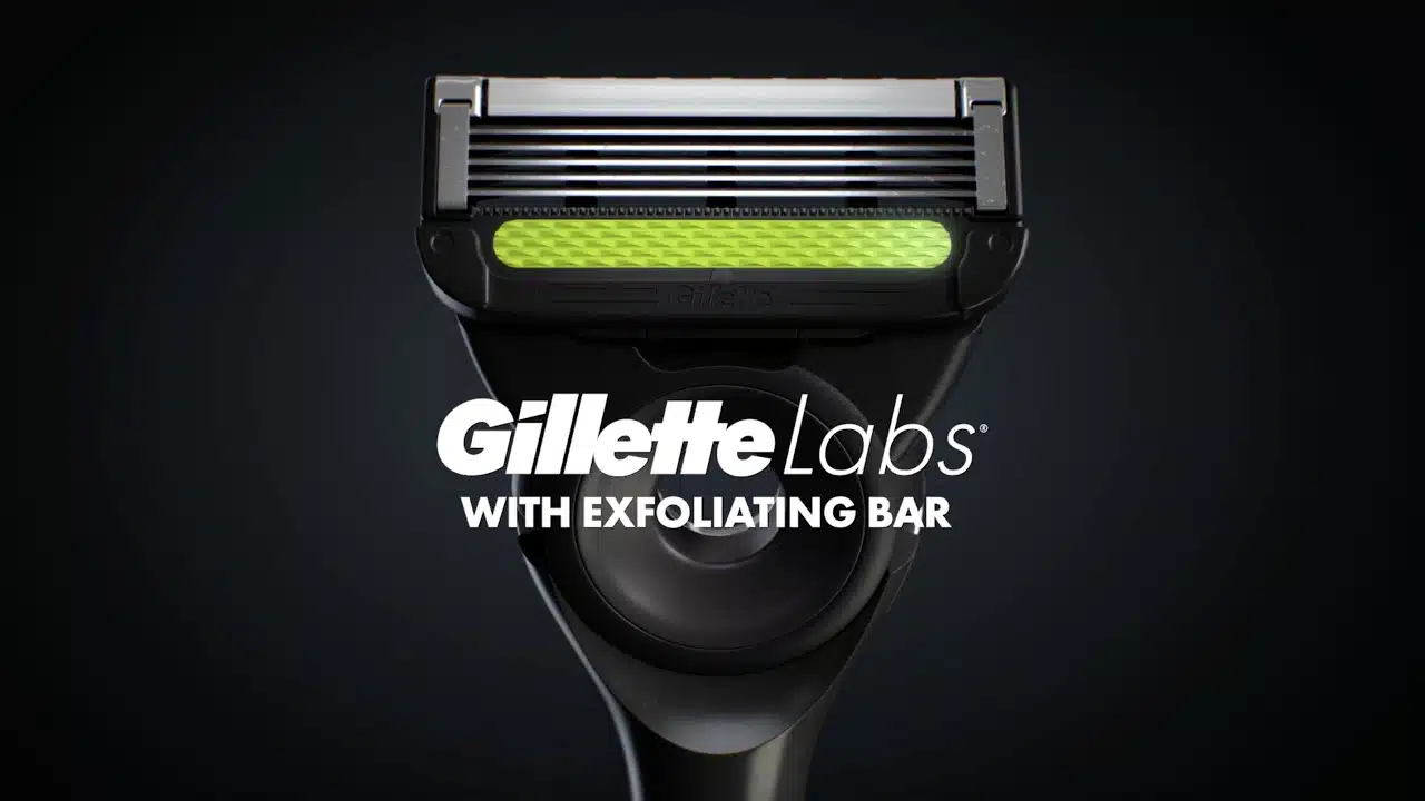
Nobody needs a 30 second explanation of what a razor is. Gillette can use that time on the new part.
The product stays visible while the commercial points out the changes and what those changes are supposed to improve. There is very little setup because the category is already understood.
This structure is especially handy when launching a new version of something people already know.
9. Emirates: Tell the Story Through an Unexpected Character
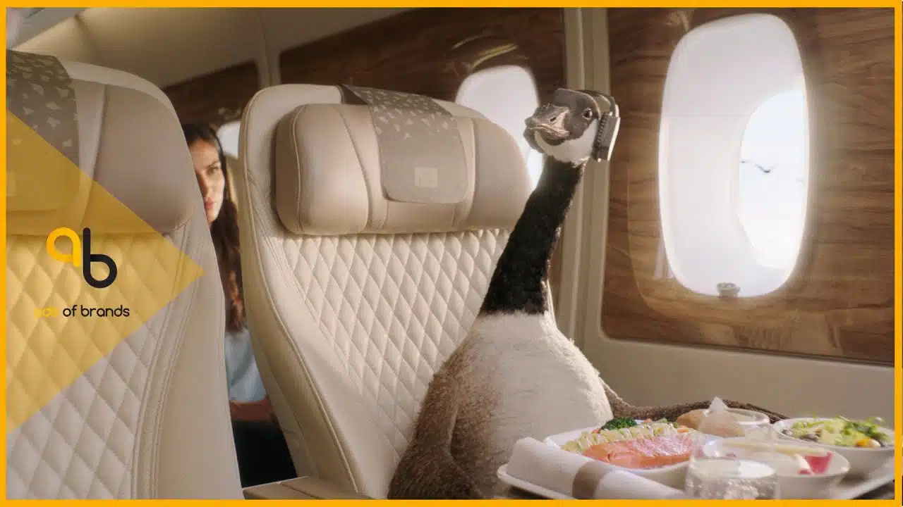
Airline advertising has no shortage of airports, smiling cabin crew, reclining seats, and shots through airplane windows.
Emirates escapes that routine by following a migrating goose. Suddenly the familiar ideas of travel, distance, comfort, and movement have a different point of view.
The lesson here is definitely not to put a bird in every travel ad. The goose works because it gives a familiar category a personality we were not expecting.
10. Samsung: Build the Promotion Video Around One Product Trait
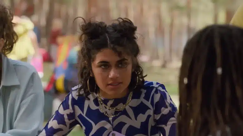
Samsung takes the fact that the phone flips and refuses to let the audience forget it.
The feature becomes the premise of the commercial instead of one item on a specification list. Characters obsess over the device, and the physical behavior of the phone drives the idea.
A distinctive product feature gets a lot more memorable once it has something to do in the story.
11. AdZerk / Kevel: Compare the Alternative Directly
AdZerk, now Kevel, assumes its B2B audience already knows the bigger alternatives.
That lets the video start with shortcomings customers may already recognize and move directly into how AdZerk approaches the problem differently. Competitive framing like this works best when the viewer has enough category knowledge to understand the comparison.
When the underlying product itself is still unfamiliar, an explainer video usually needs more room.
12. Xbox: Promote the World Around the Product
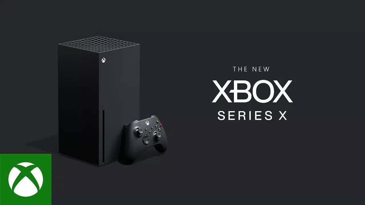
Xbox could spend the whole runtime admiring a black box from dramatic camera angles. Instead, much of the promo disappears into the worlds players can access through it.
For gaming, that makes sense. Hardware matters because of where it takes you. The experience is a much richer source of imagery than the console sitting under a television.
13. Red Bull: Use Video Promotion to Own a Lifestyle

Red Bull has spent years putting its name next to extreme sports, risk, speed, and adrenaline. By now, the drink barely needs an introduction in this kind of video.
The athletes and environments are doing brand work that a product demonstration never could. This is what lifestyle advertising looks like when the association has been built consistently enough that viewers already understand it.
14. Amazon Go: Show the Service Step by Step
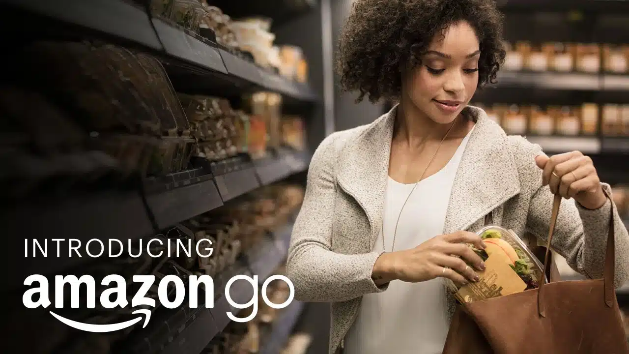
Amazon Go sounds more complicated when somebody describes the technology than when you watch a person shop.
The video simply shows the experience: enter, choose what you want, leave. Once those actions are visible, much of the technical explanation becomes unnecessary.
This is a useful approach for services, SaaS products, apps, and business models where the customer experience is simpler than the system running underneath it.
15. Heinz: Put the Product Inside a Recognizable Situation
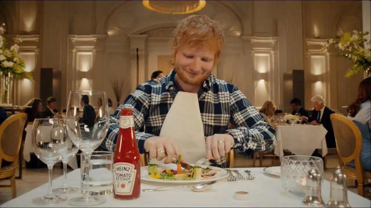
Ed Sheeran gets the commercial attention immediately, but the joke still has to make sense for Heinz.
The ad gives him a recognizable situation where his obsession with ketchup can actually play out. That is what keeps the celebrity from feeling interchangeable.
A smaller company can use the same principle with a founder, customer, chef, specialist, or local personality. Recognition helps, but relevance is doing the heavier work.
16. Chevy: Let the Emotion Arrive Before the Brand
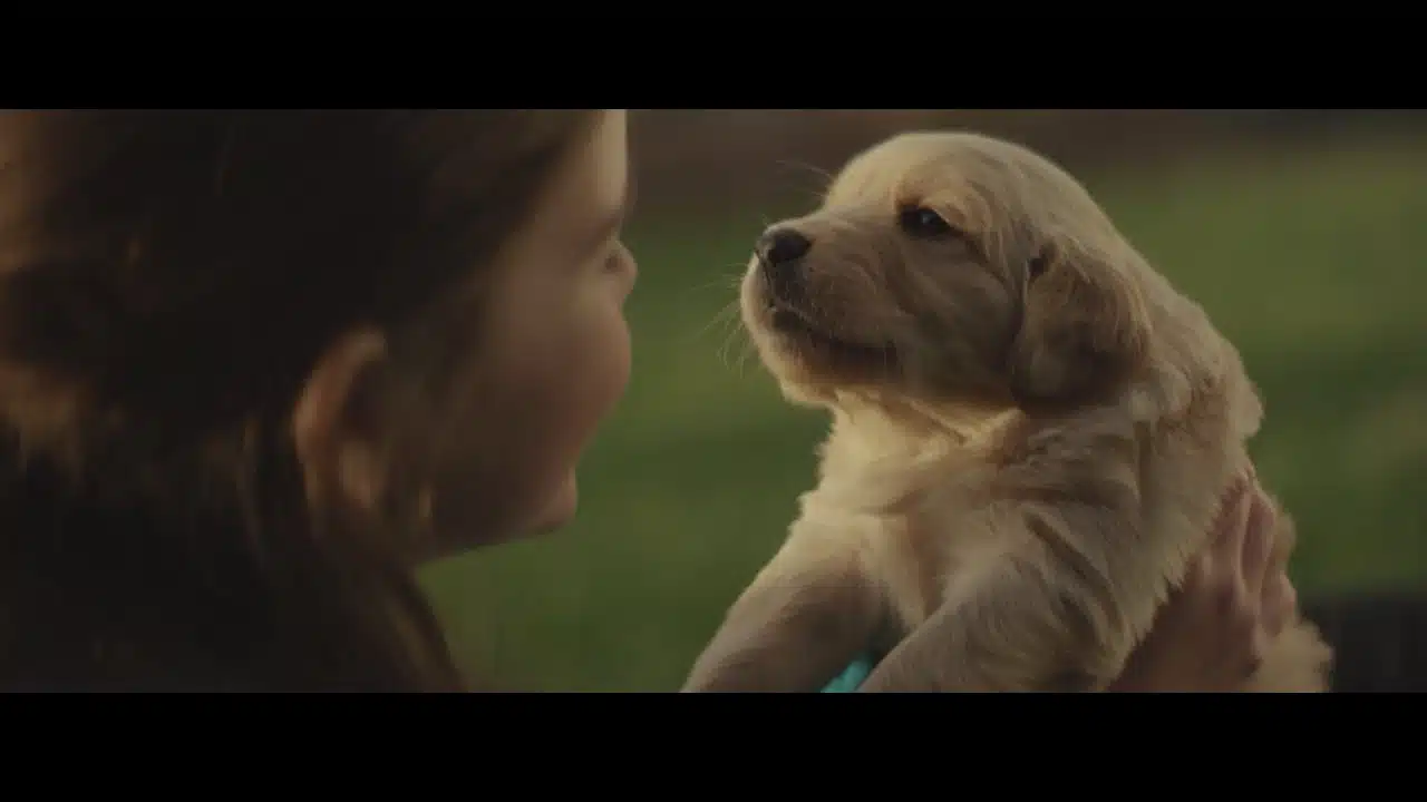
Chevy gives the woman and her dog enough time to become the story before the brand asks for attention.
The car appears inside memories across the relationship. It belongs to the emotional history instead of arriving as a sudden product shot with a list of features.
By the time Chevy becomes important, the audience already understands what the car represents in the story.
17. Philips: Make the Brand Promise Specific
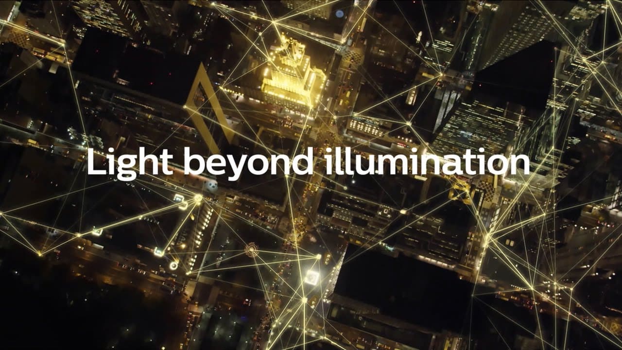
The word innovation can mean almost anything in a corporate video.
Philips gives the idea more shape by talking about where it wants lighting and energy systems to go. A future state the audience can imagine is far more useful than another collection of adjectives about being innovative.
18. The North Face x Gucci: Keep the Promo Simple
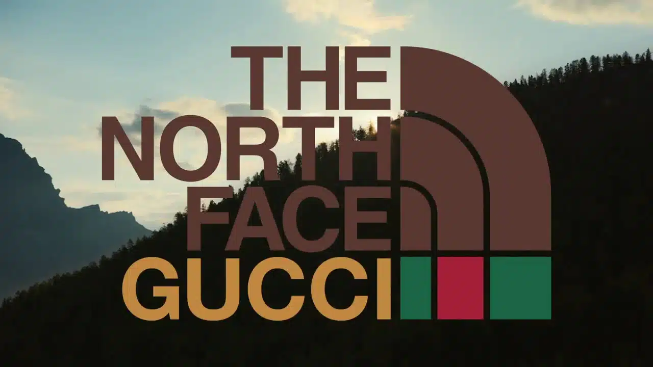
The collaboration is already news. The clothing is visually distinctive. The audience does not need an elaborate plot on top of that.
The video gives us products, people wearing them, outdoor environments, and the combined visual identity of the two brands. Most of the interest was already present before the camera started rolling.
19. Monday: Show How the Product Works
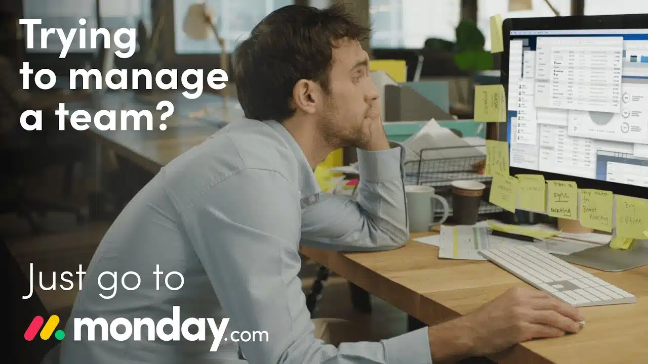
For software, the interface can be evidence.
Monday lets viewers see tasks, information, and workflows moving through the product. That gives productivity claims something concrete behind them.
A short promo video can show enough of the experience to create interest. When buyers need a deeper walkthrough, a dedicated product demo video has more room to work.
20. Spacetti: Address the User’s Questions Directly
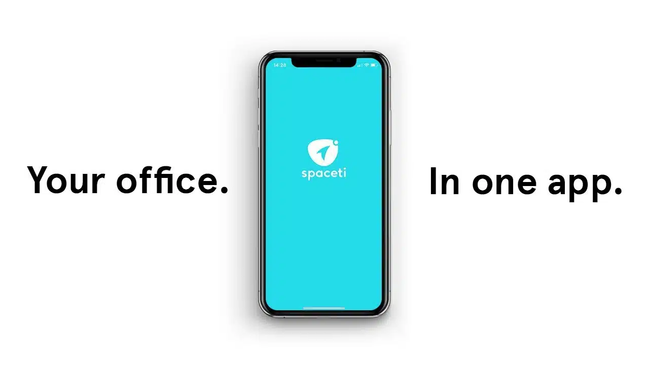
Spacetti uses questions almost like chapter titles.
Each one opens a user problem and gives the product a reason to show the corresponding feature. That structure is particularly useful for apps with several everyday use cases because the viewer never has to sit through a generic tour of the product menu.
21. Microsoft: Show the Work Behind the Product
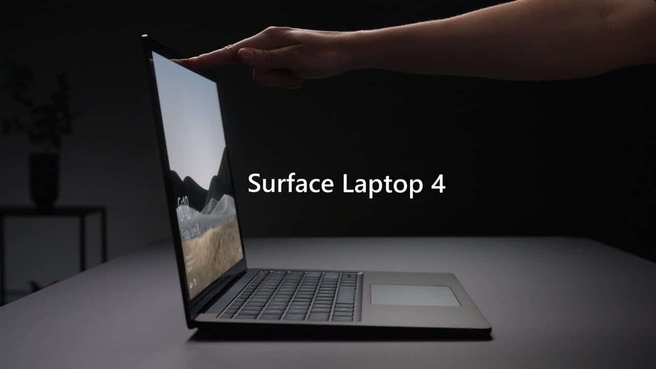
Manufacturing footage can be fascinating when the process says something about the thing being sold.
Microsoft takes viewers through materials, engineering, testing, and assembly. Those details make the finished laptop feel like the result of a series of decisions rather than an object that simply appeared on a product page.
Footage from the production process earns its place when the work itself gives the customer a reason to value the result.
22. Starbucks: Turn a Milestone Into a Promotion Video
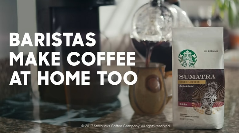
An anniversary gives a company an excuse to talk about itself. The question is whether there is actually a story behind the number.
Starbucks uses its 50th anniversary to move through employees, partners, customers, coffee, and the history around the company. The date acts as the frame rather than the entire message.
Launches, expansions, awards, acquisitions, and other milestones can work the same way when something meaningful happened around them.
23. Dropbox Paper: A 16 Second Promo Video Sample
Sixteen seconds is barely enough time to find the volume button. Dropbox Paper still manages to introduce the collaboration tool.
Graphics, music, and a few visual cues carry the idea without a traditional voiceover. The narrow runtime works because the video has a narrow assignment.
Trying to compress an entire software presentation into the same 16 seconds would be a very different story.
24. Okta: Use a Limited Visual System
Okta keeps the visual ingredients under control: simple graphics, a limited palette, and short pieces of text.
That restraint gives the message consistency without requiring a large visual world or a complicated production setup. It is also a useful reminder for promotional videos for small business: a smaller production footprint does not automatically mean a weak idea.
25. Workday: Mix Techniques With a Clear Hierarchy

Workday throws live action, animation, kinetic text, and stock footage into the same piece. That could easily turn into a showreel of unrelated techniques.
The video avoids that by giving each treatment a specific role. The audience still knows where to look, and the message remains in charge of the transitions between styles.
Promo Video Ideas Based on What You Need to Promote
Launching a Product
A launch video usually needs to establish what arrived and why somebody should notice. Samsung centers everything on the flip format. Gillette spends its time on what changed. Dropbox Paper proves how little runtime a simple product introduction may require.
Showing How a Product Works
When the experience itself is persuasive, put it on screen. Monday shows the interface, Amazon Go shows the customer journey, and Spacetti lets user questions introduce different capabilities.
For longer walkthroughs, product video production gives the product more breathing room than a short campaign asset.
Promoting the Brand
Rare Beauty uses its mission. Red Bull relies on a lifestyle association it has built for years. Nike enters a social conversation already connected to its history in sport.
Brand promotion has more freedom than a feature driven product video because the audience may be learning what the company stands for rather than how something works.
Talking About the Company
Company videos have better raw material when there is an actual event or process to talk about. Microsoft’s manufacturing story and Starbucks’ anniversary both have a concrete reason to exist.
An expansion, acquisition, new initiative, factory opening, or major milestone can give the company the same kind of narrative starting point.
Promotional Videos for Small Business
Small businesses do not need to imitate the scale of Nike or Apple. A founder explaining a product, a customer story, a short demo, or a simple social campaign can be more appropriate.
Okta is worth looking at from a production standpoint because the visual system is deliberately restrained. The structure of the message is doing plenty of work.
Event Promo Videos
Event promotion is usually much more practical. People need to understand what the event is, when it happens, who will be there, and whether it is worth their time.
Existing footage can help enormously. Speaker clips, audience moments, shots of the venue, and the registration information may be all the material the video needs.
Social Promo Videos
Social placements have very little patience for context. The first visual needs to make the subject recognizable quickly, captions have to work when sound is off, and the concept should survive shorter cuts for different placements.
What I Notice Across the Best Promotional Videos
Most of Them Make a Hard Choice About the Message
Samsung chooses the flip. Gillette chooses what changed. Dropbox Paper gives itself 16 seconds. Amazon Appstore limits how much of a larger product enters the promo.
Those choices are easy to describe after the fact and much harder to make while twenty stakeholders are still asking for their favorite feature to stay in the script.
The Product Looks Different Depending on What Needs Explaining
Monday needs its interface on screen. M&S has food that can practically advertise itself through close ups. Rare Beauty spends more time on people and mission. Amazon Go gets clarity from showing the customer moving through the store.
The visual treatment follows the communication problem. Picking animation, live action, or mixed media comes later.
Short Videos Work When the Assignment Is Also Short
Dropbox Paper can survive on 16 seconds because it is introducing one simple idea. A product with unfamiliar mechanics may need 60 or 90 seconds just to get the viewer comfortable with what is happening.
Our explainer video length guide goes deeper into runtime and script word count.
How We Plan a Promotional Video
Start With the Action You Want After the Video
A launch may be trying to create awareness. An event needs registrations. A SaaS promo might send viewers to a demo. Knowing what should happen afterward gives the script somewhere to go.
Pick the Audience Before the Message Gets Vague
The same product can sound completely different to a new customer and an existing user. Decide what this particular viewer already understands before deciding what the video needs to explain.
Find the Part Worth Building the Script Around
For a product, that could be the main benefit, an unusual feature, or a customer problem. A brand campaign may have a mission or situation instead. Our video storytelling examples show several ways those ideas can be structured.
Our explainer video script guide also covers short marketing script structure.
Work Out What the Viewer Will Actually See
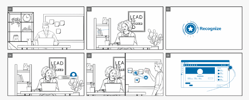
A storyboard shows us where the pictures can explain the idea and where the voiceover is doing too much. When an important point only exists in the narration, we look for a way to put some of that information on screen.
Budget and runtime affect those choices too. Our video cost guide explains the main production variables.
Plan Alternate Formats Early
A campaign may need horizontal video for one placement and square or vertical versions somewhere else. Knowing the required formats before animation or editing begins simplifies composition decisions.
Use a CTA That Belongs to the Message
If the promo introduces an event, registration is a logical next step. A product teaser may send people to a demo or landing page. Ecommerce can go directly to purchase.
By the time the CTA appears, the video should already have given the viewer a reason to take that action.
What We Have Learned From Promotional Video Production
One of the harder parts of promo production happens before anybody animates anything: deciding what gets cut.
Product teams arrive with features. Marketing has positioning it wants preserved. Sales has objections it would love the video to answer. Leave all of it in and a 60 second promo starts sounding like somebody speed reading a presentation.
We normally make those cuts during the script and storyboard. Some information stays in the video. The rest can live on the landing page, in a demo, in a sales deck, or in another piece of content.
Open Cinema is a good example from our own work. Important words had to stick, so typography became part of the visual system. Another project might call for character animation, motion graphics, product UI, or live action. Those decisions come from what the audience needs to understand.
FAQ About Promotional Videos
What is a promotional video?
A promotional video is a marketing video created around a product, service, event, company, campaign, or brand message. It can use live action, animation, product footage, screencasts, or mixed media.
What are some good promotional video examples and marketing video examples?
The examples in this article include Amazon Appstore for product value, Amazon Go for explaining a new service, Rare Beauty for brand mission, Samsung for a distinctive product feature, and Dropbox Paper for an extremely short software promo.
What is a promo video?
A promo video is usually a short marketing piece built around a particular campaign goal. Many run between 15 and 90 seconds, although products that require more explanation may need additional time.
What are the best promo videos?
The strongest examples give the viewer a manageable amount to understand. Samsung centers its spot on the flip format, Amazon Go shows the shopping experience, and Rare Beauty spends its time on what the brand represents.
What are some promotional video ideas for small business?
Small businesses can use founder stories, customer testimonials, product demonstrations, short social ads, event promos, educational pieces, and company milestone videos. The scale can stay modest as long as the subject is specific.
How long should a promotional video be?
A simple social or product promo may work in 15 to 30 seconds. Product explanations and company videos often run 60 to 90 seconds, while detailed demonstrations can go longer. Runtime should follow the amount of information the audience needs.
What is the difference between a promotional video and a product video?
Promotional video is the broader category. It can promote a product, service, event, brand, or company message. A product video stays specifically with the product, including its benefits, features, use cases, or customer experience.
Pick the Job Before the Format
Start with what should happen after somebody watches. Maybe they need to understand a new product, register for an event, visit a store, watch a demo, or simply remember one thing about the brand.
Then look at how much explanation that job requires. Amazon Go needs the customer journey. Dropbox Paper can get away with 16 seconds. Rare Beauty spends its time somewhere else entirely because the mission is the subject.
The production format comes after those decisions. A 3D product film, a screencast, a live action brand story, and a simple animated promo can all belong in the same category without looking anything alike.

Victor Blasco
Co-founder of Yum Yum Videos | Explainer Video & Video Marketing Expert
Victor Blasco has over 25 years of experience in animation and film production. For the past 14+ years, he has worked with companies to create explainer and marketing videos that simplify complex ideas and drive business results.
His work has supported global brands like Amazon and McKesson, as well as startups that raised over $2B and reached unicorn or IPO stages.
Victor shares insights based on real client work. His contributions have been published on platforms like Social Media Examiner, and he has been featured or quoted in outlets such as Forbes.