Best 30 YouTube Intros to Learn From!
28/10/24
Author: Florencia Corazza
19 min reading
Video ProductionMarketing

By now, you’re probably familiar with all the reasons why starting a YouTube channel is a smart move—building your brand, growing an audience, and even attracting customers. But if you really want to take your content to the next level, there’s one thing that can make a big difference: a well-crafted YouTube intro
Not sure what that is? Don’t worry! In this piece, I’m going to tell you all about this crucial (yet often disregarded) element that can give your videos a more professional look and strengthen your brand identity. Most importantly, I’m also going to share 30 great examples and break down what we can learn from them.
Let’s discover what the pros can teach us today!
What Are YouTube Intros?
YouTube intros are like a TV show’s title sequence, short scenes at the beginning of a video that helps establish a channel’s identity. Over time, the specific elements in your intro, such as the music and the visuals, will foster loyalty and recognition among your viewers.
These sequences can be used for a wide variety of purposes, from setting yourself apart from the competition to getting people excited about your content. Just like we focus on Youtube banner size, we should pay attention to intros as well. They both strengthen your brand identity, make your pieces look more professional, and even keep a level of consistency.
Why Does a Good YouTube Intro Matter?
Obviously, everyone wants viewers to stick around and engage with their videos. And the good news is that a solid YouTube intro can give you that opportunity. It’s useful to grab their attention, set the tone for your content, and make them want to stick around and watch more.
A well-crafted intro communicates your brand’s personality, and also establishes a unique identity that sets you apart. Plus, it builds anticipation for your content, making viewers eager to see what you have to offer.
When your subscribers consistently see the same intro across your videos, they begin to associate it with your channel and its content. This familiarity builds loyalty and encourages viewers to return for more.
All in all, if you’re wondering how to create a professional YouTube channel, I would suggest focusing on the intro first. It’s an investment in your channel’s long-term success.
How to Make a YouTube Intro That Drives Results?
Creating a killer intro requires time, effort, creativity, and proper planning. So, here are some points that you can consider:
- Keep It Concise & Short: No one likes to watch just your company info for 1 to 2 minutes. After all, that’s not why they clicked on the thumbnail! Speaking of thumbnails, always remember to create an eye-catching one. This could be a frame from the video, a combination of several shots using a split-screen photo app, or something custom-made in Photoshop that really grabs attention. So, keep your intro brief and to the point. Aim for 5–10 seconds to capture attention without losing viewers’ interest.
- Show Your Brand: Your intro is a valuable opportunity to show your brand identity. Add your logo, brand colors, and any other visual elements that represent your company.
- Choose the Right Music: Music sets the tone and mood for your video. Select a track that fits with your brand personality and the overall feel of your content. For example, upbeat and energetic music creates excitement, while a more relaxed track conveys a calm vibe.
- Add Call to Action: Encourage viewers to engage with your channel by subscribing, liking the video, or following you on social media. A clear call to action helps you build a loyal audience and increase your channel’s reach.
Best YouTube Intros Out There
Now we’ve come to the fun part: examples. As usual, I’ve made sure to include a wide variety of intros from different industries and all channel sizes so you can (hopefully!) find lots of inspiration. Now, in no particular order, let me show you some cool YouTube intros!
Table of Contents
1. TED
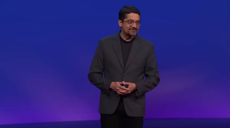
I’m sure we’ve all watched a TED Talk at least once in our lives. But, if you’re one of the odd ones out and don’t know what I’m talking about, this channel focuses on learning and features inspiring talks from some of the world’s leading thinkers.
Ted’s latest YouTube intro starts with the channel’s logo exploding out to a “raindrop” sound in the background. The bubbles shooting out from the logo represent ideas spreading and knowledge being shared in a style that reflects TED’s minimal branding. It’s only about 4 seconds long, but it’s still pretty effective, don’t you think?
2. CrashCourse
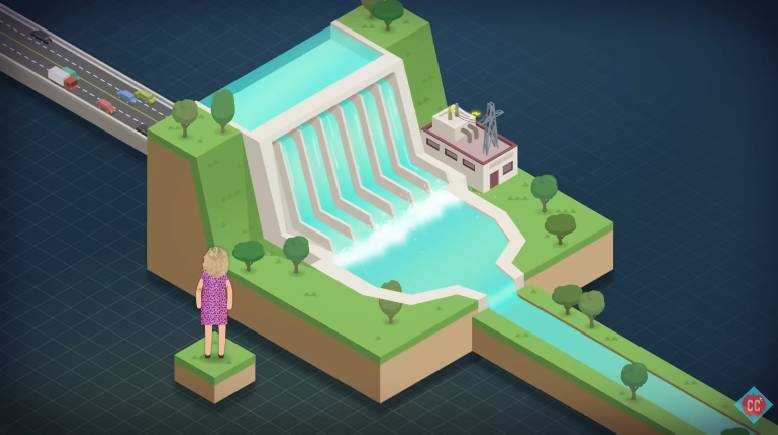
Animation is one of the best tools to create highly engaging and memorable intros, and CrashCourse knows that well. This channel uploads educational videos that typically cover varied scientific topics, and each series features a different intro.
For example, the animated video series about climate change begins with a brief summary of the topic at hand, leveraging animation to make transitions smoother and more engaging. Then, the introduction ends with a shot of the channel’s logo and art to reinforce recognition.
3. WIRED Autocomplete Interview
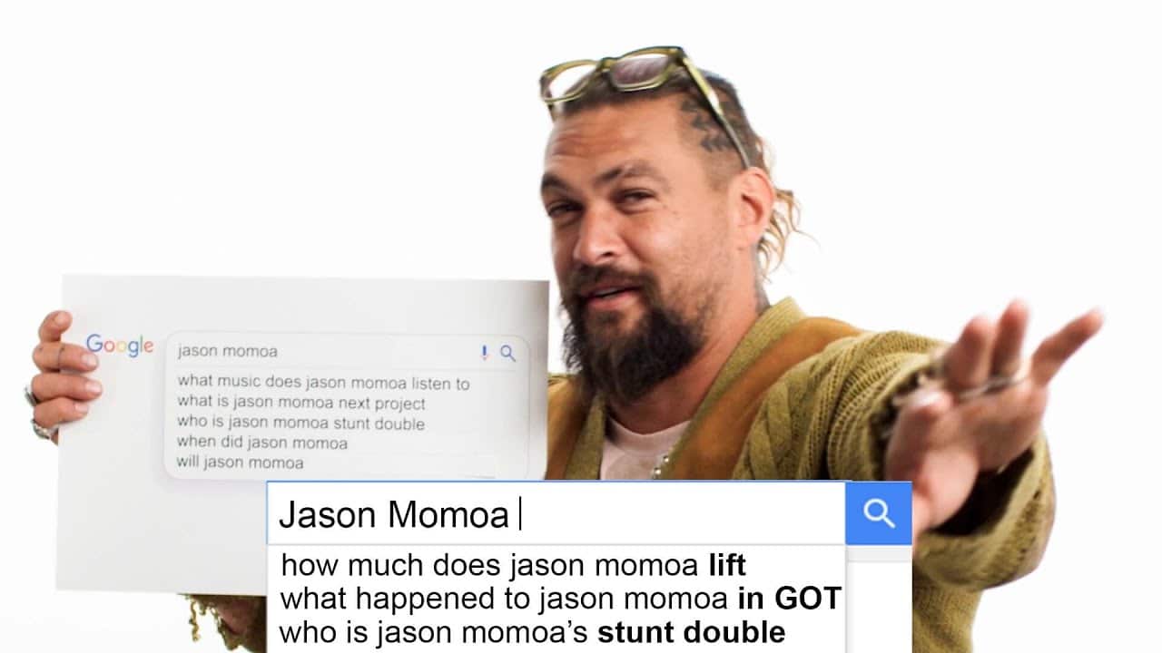
WIRED magazine’s autocomplete interviews are quite popular, with millions of views on YouTube. If you haven’t come across one of them yet, they feature celebrities answering the Google autocomplete results for questions about themselves and their lives.
The YouTube intro of the interviews is quite simple. The celebrities say their names, and then there’s a very short explanation of what the autocomplete interview is all about. While it’s true that there’s nothing crazy about this intro, the simple style perfectly fits the channel’s minimalistic style.
4. WatchMojo.com
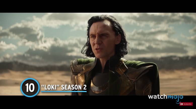
WatchMojo’s intro is so subtle that, at first, you might not recognize it as such. In fact, the phrase “Welcome to WatchMojo, and today, we’re counting down…” is so characteristic that the channel needs no further introduction.
But what can we learn from this? Well, coming up with something unique to represent your channel’s voice and image is crucial to making you easily identifiable among the competition. It might take some trial and error at first but don’t despair because it’ll be worth the effort in the long run. They’ve even cleverly integrated it into their channel branding and Youtube playlists.
5. BrightInsight
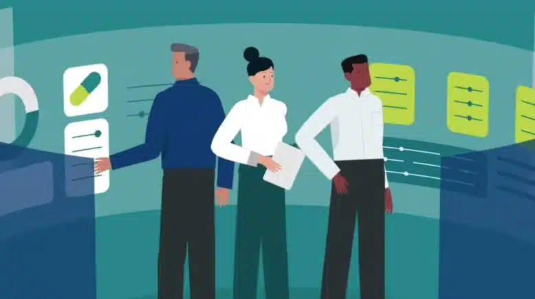
Your channel might have different types of videos, so it might be tricky to keep your YouTube intros consistent. On top of that, branding an explainer video, for example, is not always easy. You don’t want to be intrusive with your logo, and while you can use your color palette for that purpose, people won’t always relate it to your brand. For those reasons, using the intro to briefly and quickly introduce branding elements like your logo can be of great help.
BrightInsight has a cool way of doing this. Their intro uses animation to explain their work in a way that’s easy to understand and visually interesting. And it’s a great example of how to make a YouTube intro that quickly shows off your brand and makes your videos look more professional.
6. Foundr Magazine
Foundr Magazine is a media and education company that features successful entrepreneurs sharing their experiences and strategies in the form of actionable content that the audience can use to build and grow their own businesses.
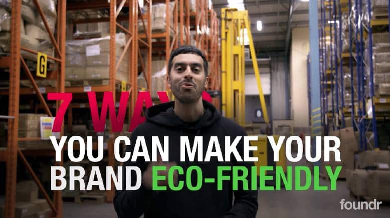
This particular YouTube intro presents the video’s title using big, bold text to grab the eye and generate curiosity. Then, it switches to a series of the magazine’s covers that transform into the logo, reflecting the company’s long history in the industry.
7. Vlad and Niki
Choosing the right music theme is crucial for a successful intro, and it should always go well with the brand’s tone, voice, and even the type of content. Otherwise, it’ll come across as strange and might even give the impression that your channel is still at beginner’s level —something we really want to avoid!
This channel is a great example of how how to make a YouTube intro that leverages music to align with the target audience. Here, the viewers are kids and their families, so the music is upbeat and fun. The choice goes perfectly with the animated intro, which is full of colorful elements that are also highly appealing to children.
8. SafiyaNygaard
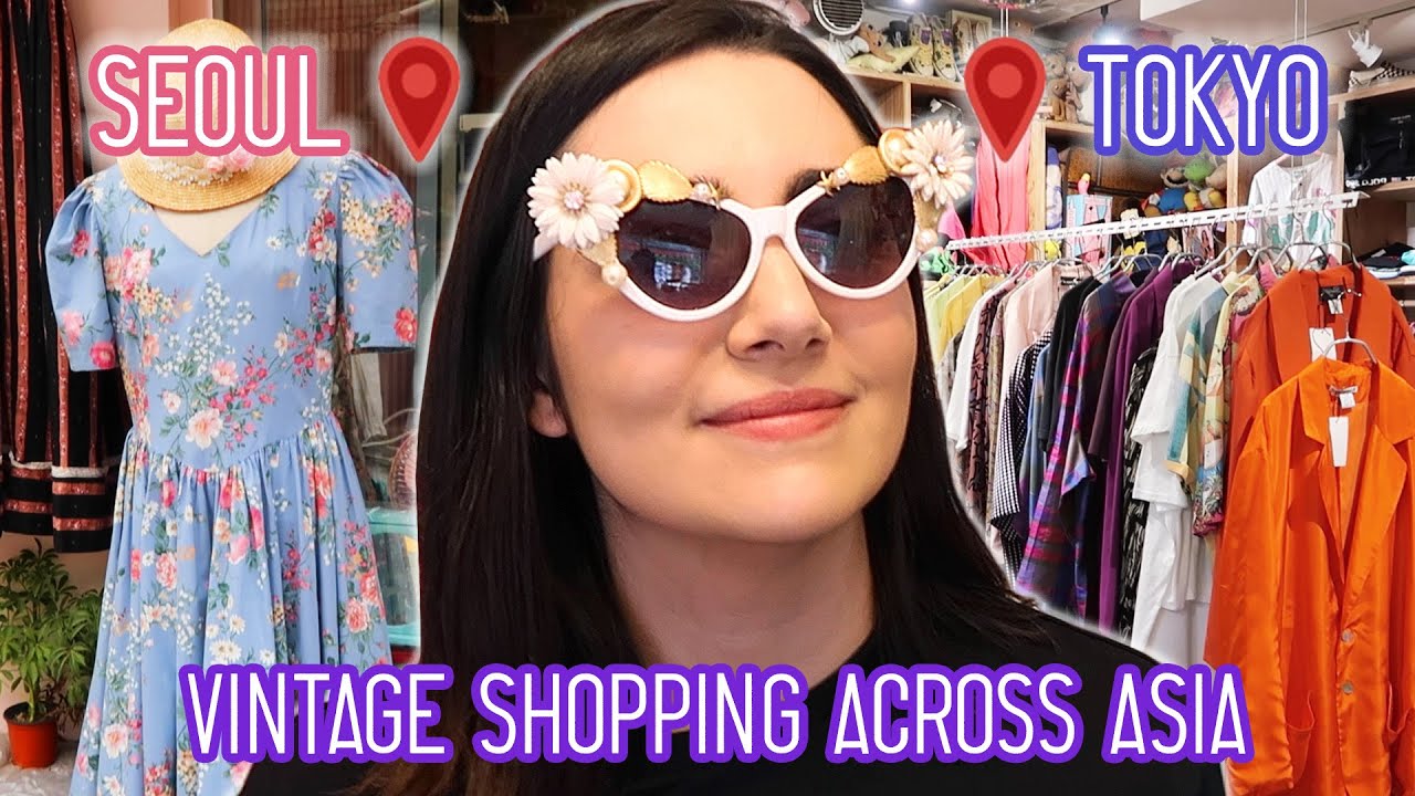
YouTube intros don’t have to be incredibly complex and intricate to be effective; just take a look at this example. Safiya Nygaard, a popular beauty and lifestyle channel, has quick and simple intros that are nonetheless easily recognizable by anyone who’s been a subscriber for some time now.
Even better is that the final frame is tailored to each video’s particular topic. In this example, the topic is “vintage shopping across Asia,” and the intro’s last frame has emojis of a dress and a plane. It might not look like much, but it’s a fun and extremely easy way to personalize your intro and keep it current.
9. Recognize
Another great tactic to make the most out of your YouTube intro is to present a problem that your audience has and that you can solve and then introduce your channel’s logo or name. This way, your viewers will find value in your YouTube content ideas and connect that value with your branding. So, the next time they come across your content, they might be intrigued enough to hit “play”!
10. Good Mythical Morning
Good Mythical Morning has an extensive track record on YouTube. The presenters, Rhett and Link, have been exploring new products and trends, carrying out experiments, and eating all kinds of crazy things for several years now.
Their YouTube intros have always been great, but their most recent one is an animated masterpiece that looks like something from a TV show title sequence. I like how the unique style reflects the channel’s weirdness and uniqueness while representing its subject matter in a fun way.
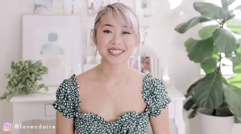
11. Lavendaire
Lavendaire’s intro is incredibly short —just 5 seconds long! In that tiny time frame, she uses footage and images of herself that represent the video’s subject matter: fear and self-doubt.
Such a strategy can help the viewer relate to the situation more easily and increase their curiosity about the video’s content. Moreover, the aesthetic and soft background music go really well with the topic at hand and match the channel’s image and tone.
12. The Diary of a CEO
.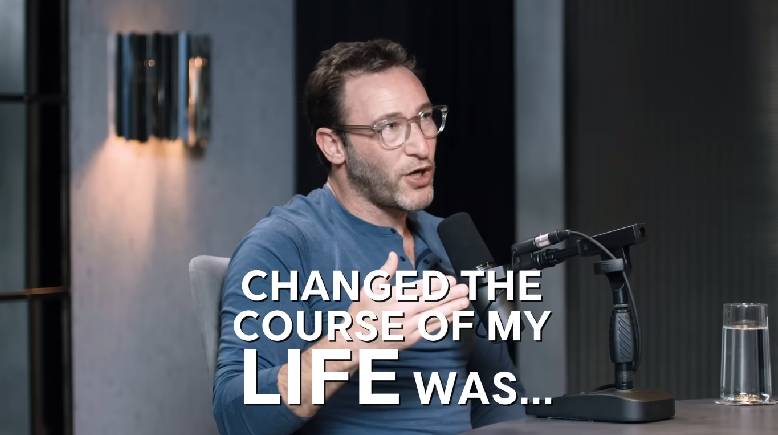
This is one of my favorite YouTube intros on this list because of how clever it is. It features snippets and key outtakes from the actual interview, but some of them are cut off at the most important or interesting part. This tactic instantly piques the viewer’s interest and encourages them to watch the video to discover what’s missing. On top of that, there are even a few seconds dedicated to introducing the interviewee in between the snippets!
13. Kurzgesagt – In a Nutshell
This channel makes animated videos that break down complex scientific topics into pieces that anyone can easily understand. Their intro is animated in the same distinct style as the video’s content, featuring fun characters, rich colors, and upbeat background music.
We are taken on a journey around an erupting volcano, through a colorful forest, and over a futuristic city to finally land on our own planet. All of this happens in a matter of seconds, but the entire sequence is just a delight to watch, and it lets us know that we’re going to see something new and different.
14. CinemaSins
CinemaSins is a movie review channel that specializes in breaking down everything movies do wrong. In the creator’s words, each video counts out the number of “sins” the movie makes.
In this YouTube intro, the combination of dramatic music and lighting as the words “Everything wrong with” appear on the screen makes it look like something you’d see on a movie intro. But what I like about this particular example is how, as the movie’s title is shown, the music changes to something goofy, and then you see the words “Spoilers… duh.”
This tells the audience everything they need to know about the video and the channel in just a few seconds: not to take them too seriously.
15. Yum Yum Videos
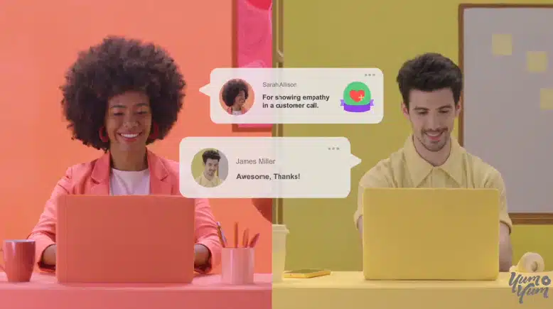
When your content is about complex processes or abstract topics, an animated intro can be your greatest ally. You can’t really get footage of the video production process, as most people would most likely have a hard time understanding what’s going on. So here, at Yum Yum Videos, we decided to make a short animated intro to present the topic at hand. In a matter of seconds, our viewers will be able to easily understand what they’ll gain from watching.
16. SophieMichelle ASMR
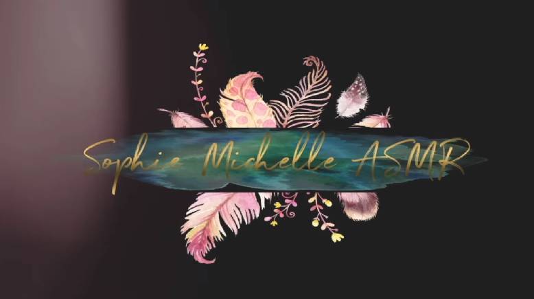
If you’re familiar with ASMR, then you can probably tell that this relaxing YouTube intro is very fitting. Just like the video’s content, the intro it’s calm and slow-paced, and the dark, muted tones of the logo perfectly complement the overall relaxing atmosphere of this piece.
17. DollarSprout
This example begins by presenting a relatable situation that the viewers could easily find themselves in, followed by a brief summary of what the video will be about. Then, there’s a logo sequence that gives the video a more professional look.
If you’re just starting out, maybe you don’t have the budget to animate an entire YouTube intro. However, you might have enough to animate your logo! This can be an easy and straightforward way to encourage viewers to take you and your content more seriously.
18. The Life Guide
Another option to make a YouTube intro for your content is to use stock footage or video templates and a video maker. The Life Guide makes educational content about a wide range of topics, and their intro reflects that. By featuring a series of shots of different scenes, such as a soap bubble, a sunrise, a building, the moon, and more, they can convey that their pieces are packed full of information. Moreover, the punchy music tells us that the channel’s pieces condense many complicated topics into engaging videos.
19. Phil Town’s Rule #1 Investing
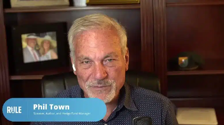
On the other hand, if you’ve been in the game for a while now, you probably have tons of content already uploaded to your channel. So, why not make a video montage that showcases your track record?
These types of YouTube intros are perfect if you want to increase the believability and trustworthiness of your channel because people will be able to see you are no rookie but an authority in your niche instead.
20. Frog Leap Studios
While music videos don’t usually have intros on YouTube, it doesn’t mean they shouldn’t! This channel uploads weekly music covers, and the 3-second intro (yes, you’ve read that right) does an excellent job of strengthening branding and recognition. Moreover, the contrast between the soft, almost ASMR, voice saying the channel’s name in the intro and the loud rock music make for a memorable experience the viewer won’t soon forget.
21. Mindy McKnight
This is a good example of how spoilers are not always bad. Mindy McKnight’s channel is full of hair tutorials, and the intros typically let the viewer see the final results from the very first second. This is a clever way to let the audience know what the video will be about and encourage them to watch by making them curious about the process to reach the results shown at the beginning.
22. The British Library
Here’s another example that shows how an animated logo with the right background music or sound effects can be more than enough to make a good YouTube intro. Quick, simple, straightforward, and low-budget —what more could one possibly want?
As I’ve mentioned before, this can be a wonderful strategy for a channel that’s just starting to take off because it helps your viewers associate your content with your logo and, thus, with your channel and branding.
23. BuzzFeed Video
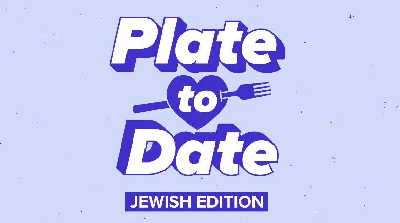
People often associate big channels with elaborate intros and high-production footage, but that isn’t always the case. Buzzfeed is a hugely successful YouTube channel, but their intro for the Plate to Date series remains quite minimalistic.
In this series, a suitor tries out dishes prepared by mystery prospective partners, and the winner gets a date. The intro features the suitor introducing herself and the dish that’s going to be made; then we see a frame with the series logo and a sign that reads “Jewish edition” underneath.
If you pay attention to it, the only animated element of this frame is the grain on the background, and the color and the sign change from episode to episode. Again, this is a great low-cost idea to personalize your intros and tailor them to each video.
24. Mady Morrison
Mady Morrison is a fitness channel that uploads relaxing yoga videos. Now, the fast-paced, punchy intro might be at odds with the channel’s content, but have you ever struggled with getting your workout started? Well, this YouTube intro seeks to get viewers pumped and ready to work out!
So, you don’t always need an intro that’s fully representative of your subject matter if you manage to make something that’s engaging and makes people want to watch the rest of your video.
25. Android Authority
When your channel is dedicated to reviewing and comparing different products, building intrigue around them is crucial to making people stay and watch. So, you need to take advantage of those precious seconds of intro to do that.
It can be a good idea to follow Android Authority’s example and use the intro to tell the viewer what value they’ll get from watching the video before showing the logo sequence. This way, people will immediately associate that value with your branding.
26. Matt Byrom
Matt Byrom’s YouTube channel dives into business strategies, entrepreneurship, and actionable advice for scaling companies. His intro is professional yet inviting, featuring clean visuals that include his name and logo animated subtly on a dark, sleek background.
The intro has a simple, professional feel with a quick, calm sound cue that sets a focused tone for his business-savvy audience. This approach helps viewers instantly recognize his content and reinforces the professional vibe that Matt’s channel is all about. Moreover, the short explanation of what the video will be about easily lets viewers know what to expect from the piece.
27. Marques Brownlee (MKBHD)
Tech reviewers often lean toward futuristic and sleek visuals, and Marques Brownlee’s channel nails this vibe. MKBHD’s intro is quick and to the point — it features his iconic red logo flashing across the screen, accompanied by a short sound effect.
This intro keeps the branding clear and modern, aligning with the high-quality, tech-focused content his subscribers expect. Marques’ minimalistic approach to his intro is a solid reminder that less can often be more — especially in tech spaces.
28. Bon Appétit
Bon Appétit’s YouTube intro stands out by keeping things casual and inviting. The intro shows a shot of the BA Test Kitchen, with chefs busy in the background, instantly familiar to fans. The Chef who will be cooking in that particular video also introduces herself, which is a great way to hook the audience.
There’s no animation or complex graphics — instead, it’s just a candid look that captures the warm, community-driven vibe of the channel. It’s a great example of how authenticity is an asset — especially in a genre where connection with viewers is key.
29. Yes Theory
If you’re looking for YouTube intro ideas that are as thrilling as the content itself, Yes Theory has it down. Known for pushing limits and encouraging viewers to seek discomfort, their intro perfectly matches their adventurous spirit.
It kicks off with fast-paced clips of adrenaline-filled activities like skydiving and mountain climbing, giving a taste of the excitement ahead. The bold display of the channel’s name, paired with upbeat music, brings an instant rush of energy and makes viewers feel like they’re right there in the action. This type of high-energy intro is ideal for channels focused on inspiration, motivation, or exploration — drawing viewers into a world where comfort zones don’t exist.
30. The Minimalists
This intro perfectly reflects The Minimalists’ style. It starts with a black background and some simple white lines moving around, leading to the channel’s logo — a small “m” inside a circle.
The soft animation and gentle music create a calm vibe, matching the channel’s message about living simply. It’s quick, clean, and doesn’t distract from the main content, which sets the stage for viewers to dive into a more mindful way of living.
What’s the Best Duration and Size for YouTube Intros?
When we look at Youtube stats, short & sweet intros always win. So, aim for something that’s around 5 to 10 seconds long. 20 seconds intros are also good, but more than that will just grow your viewers away. You want to grab your viewers’ attention quickly and get to the main event — your video!
A longer intro might make people click away before they even see your awesome content. And make sure your intro fills the whole screen so it looks sharp and professional. No one wants to watch a blurry or pixelated intro.
By keeping your intro concise and visually appealing, you’ll create a welcoming experience for your viewers and make sure they stick around to see what you have to offer.
Wrapping Up
And there you have it —30 best Youtube intros to learn from! As you’ve probably seen, there’s no recipe for making your intro, but there’s also no wrong way to approach it. There are many different ways you can tackle this element, and which one works best for you will ultimately depend on what goals you’re pursuing.
Do you want to elevate your videos and your channel? Do you want to get people pumped about your content? Think about the reaction you want to elicit in your viewers and get down to business!

Florencia Corazza – Content Writer and Co-Editor
A skilled writer, translator, and co-editor for our web and blog content. As a self-defined "wordsmith," she’s talented in adapting the latest marketing news into all kinds of digital formats. If she’s not watching the latest Sci-Fi show on Netflix, then can find her tending to her perfectly reasonable number of plants.

