Video Thumbnail Guide: How to Make a Great Video Thumbnail
06/09/20
Author: Florencia Oliveto
22 min reading
Video ProductionMarketingStrategy

We’ve all watched enough Disney movies during our childhoods to know first impressions can be deceitful. And yet, most viewers rely on video thumbnails to choose whether they watch a video or ignore it.
You can hardly blame them, though. After all, a thumbnail can speak volumes about a piece and the effort you’ve put into it.
More than a representation of your video’s content, a good thumbnail is a powerful tool to tantalize viewers. The right thumbnail works like a flower to honey bees, generating intrigue and curiosity in the audience and prompting them to click on your awesome video content.
So, if you are having trouble attracting new viewers to your videos, you’ve come to the right place! We’ve put together all the information you’ll need on how to make a good thumbnail and attract more eyes to your pieces.
Don’t let their size deceive you: there’s a lot to learn about this tiny but mighty tool. Let’s get to it, shall we?
Table of Contents
1. What Is a Thumbnail? – Video Thumbnail Definition
Even if you have never heard the formal definition, you’ve undoubtedly seen thumbnail examples in action before: small images that act as a preview for videos in result pages, website embeddings, and social media platforms.
So, what is a thumbnail? It’s a miniature version of a larger piece of content, being as relatively small as a human thumbnail; that’s where the name comes from.
Once you click on the thumbnail, you get to access the video in its original size.
The purpose of video thumbnails is to give viewers a sense of what the actual video is about before they click on it. In fact, a good thumbnail reveals tons about a video at just a glance, simplifying the browsing experience in video search engines and social media.
All in all, thumbnails provide an organized and quick way of searching and finding new content.
2. Why Use Video Thumbnails?
Learning how to make a good thumbnail isn’t just about aesthetic decisions ―it’s also a powerful video marketing tactic.
For starters, a great video thumbnail allows you to capture new viewers’ attention without having to break the bank. As you’ll see later on, there are many free or low-cost tools to make YouTube thumbnails.
Good thumbnails also contribute to a user-friendly experience for anyone visiting your web page, YouTube channel, or social media profile. They help them go through your content comfortably and click on whatever interests them the most.
Taking that into account, video thumbnails can be a great addition to your webpage, as they help structure your content display. Best part? They don’t compromise your website loading times! Their file size is as small as their aspect, so you can add them to your web page design without any unwanted page load strain.
3. How to Make A Good Thumbnail for Your Video?
Regardless of the video’s topic, good thumbnails tend to have certain aspects in common. Let’s see which those are and how you can implement them!
Create Thumbnails for Any Device
Your audience will see your thumbnails on different-sized devices, from small cell phones to wide smart TVs and everything in between.
In that framework, a good thumbnail is one that can be seen clearly on all of those devices. In fact, many of the best practices that we’ll cover later on are closely related to making your thumbnail understandable regardless of screen size, such as using close-up images and big text.
Use Branding On Your Video Thumbnails
As you may know, all your marketing elements should be branded adequately ― and video thumbnails are no exception.
A good thumbnail helps viewers recognize your brand at a glance. Take the opportunity to display your logo, a watermark, your brand’s color palette, a distinctive typeface, or other similar branding elements. Regardless of the “how”, branding your thumbnails gives your content’s previews a cohesive look and style.
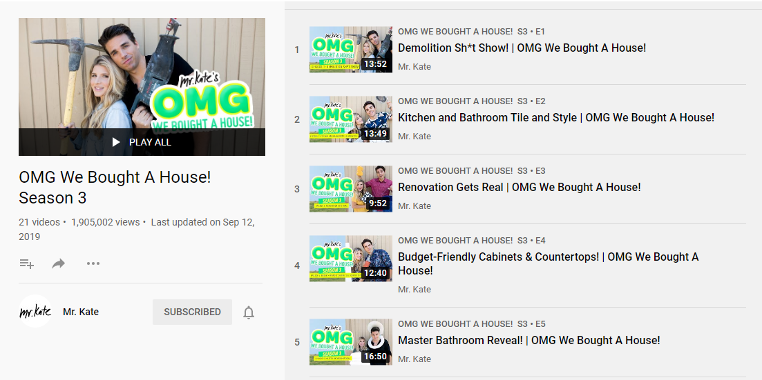
Now, branding is particularly important when it comes to video series. In those instances, each thumbnail should have a similar and consistent aesthetic. A good idea is to use the same template as a base for all the video series’ thumbnails.
Always Go with Honest Thumbnails!
Regardless of the picture you decide to show on your thumbnail, it should be tightly related to your video’s topic.
It doesn’t hurt to make YouTube thumbnails that exaggerate your content a bit, though. As a matter of fact, that can help you capture viewers’ attention. But there’s a clear-cut difference between dramatization… and click-bait.
That’s a big no-no. Some content creators wrongly believe that using a more appealing ―albeit disingenuous―thumbnail will get them more views even if it’s unrelated to their videos, but it isn’t actually the case.
Misleading your viewers into clicking a video can negatively affect your video’s view count and watch time. After all, viewers are likely to leave your video as soon as they realize they were cheated ―sometimes early enough for their visit to not count as a view.
Besides, if you make YouTube thumbnails that deceive your viewers, the platform might penalize your content on results pages. So you would end up appearing lower in search rankings, amassing fewer views than if you had shown a less attractive yet honest thumbnail.
4. Video Thumbnail Specs
Every social media platform is a world of its own, and each has distinct guidelines regarding video thumbnails. Let’s explore which details you should take into account before uploading a thumbnail to any of the most popular social networks.
YouTube Thumbnail Size
Remember what we’ve said about your thumbnail appearing on a wide variety of devices? Taking this into account, you need to make YouTube thumbnails that look as good on small screens as they do on big ones.
But precisely what size should a YouTube thumbnail be? Well, there are many answers to that question since there’s no rule for YouTube thumbnail dimensions. That said, the platform recommends using high-resolution images, as they don’t look pixelated when appearing on larger screens. Any good thumbnail for this platform has a minimum of 640 pixels in width, although the recommended YouTube thumbnail size is 1280×720 pixels.
Another important detail for anyone who wants to make YouTube thumbnails would be the aspect ratio. The one you’ll find in most YouTube players and previews is the 16:9 (full landscape), so that’s the one we recommend.
Do keep in mind, though, that whatever YouTube thumbnail size you end up going for, the file must always be .JPG, .GIF, or .PNG, and weigh less than 2 MB.
Now, let’s do a quick recap of YouTube thumbnail’s recommended specs:
- YouTube Thumbnail Dimensions: 1280×720 px (minimum width of 640 px)
- Aspect Ratio: 16:9 (landscape)
- File Format: .JPG / .GIF / .PNG
- Max. File Size: 2MB
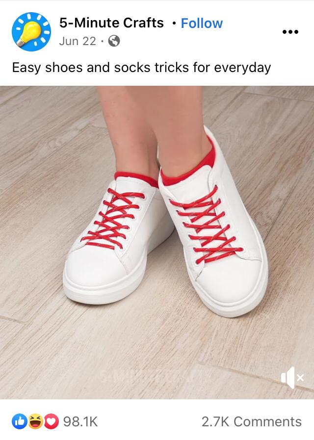
Facebook Thumbnail Size
Your Facebook thumbnail should be a high-resolution image of 1280×675 pixels ―or at least have a minimum width of 600 pixels.
It should also have the same aspect ratio as your video so it doesn’t look stretched or have black borders on the edges.
The thing is, there are different types of aspect ratios available depending on the kind of Facebook video you go for (organic post or video ad) and the devices your audience uses the most.
For Facebook video ad thumbnails, you should pick one of the following aspect ratios:
- Landscape (16:9). Ideal for TV and desktop users.
- Square (1:1). Ideal for cell phone users.
Now, when it comes to organic Facebook videos, you should choose between these aspect ratios:
- Landscape.
- Portrait / Vertical (9:16). Ideal for cell phone users.
So, summing up:
- Facebook Thumbnail Dimensions: 1280×675 px
- Aspect Ratio: 16:9 or 1:1 for ads; 16:9 or 9:16 for organic posts.
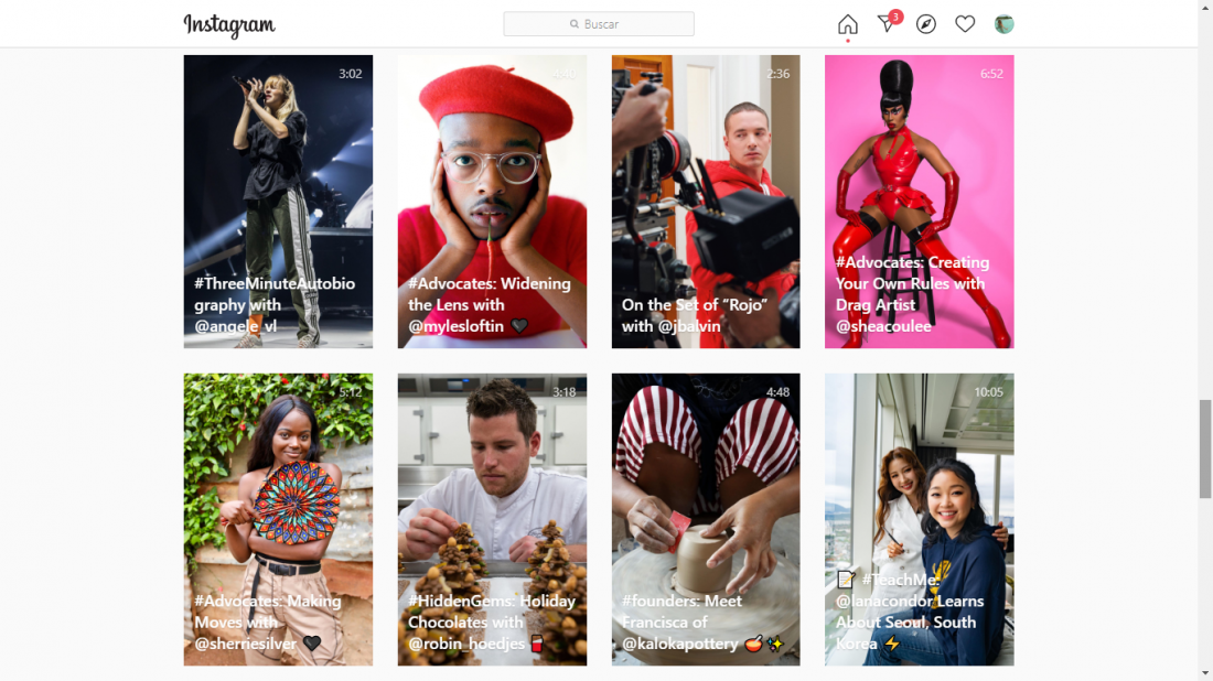
Instagram Thumbnail Size
Any Instagram user is familiar with the platform’s annoying tendency to crop images, so it’s probably no surprise it’s an issue that also applies to cover photos ― or “videothumbnails” in Insta jargon. But there’s a valid reason: an IGTV thumbnail appears in different locations, each calling for a distinct aspect ratio and size.
So, even if Instagram recommends using cover images of 420×654 pixels and an aspect ratio of 1:1.55, the truth is that those thumbnail dimensions only appear on the IGTV app’s interface.
When shown on the Instagram feed, cover images shift to a vertical aspect ratio of 4:5. In the Instagram search grid, however, they become entirely square (1:1 ratio) and are cropped on all sides.
As a result, a good thumbnail is the one that can be seen correctly with any of the mentioned aspect ratios, even if cropped. That’s why we strongly recommend you to focus on the center of your cover image, keeping your video thumbnail’s subject and text overlays away from the edges.
Regardless of its dimensions, an IGTV thumbnail should always be in .JPG or .PNG format, weighing less than 4 MB.
One final caveat before we move on: choose your IGTV thumbnail wisely. Once you’ve uploaded it, IGTV won’t allow you to change it.
Let’s go over this data one last time:
- IGTV Thumbnail Dimensions: 420×654 px
- Aspect Ratio: 1:1.55
- File Format: .JPG / .PNG
- Max. File Size: 4MB
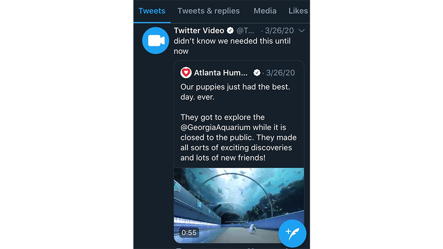
Twitter Thumbnail Size
Unlike Instagram, it is possible to change thumbnails on Twitter videos, being able to use a still frame or a custom image.
For the latter, the platform recommends using thumbnails of an aspect ratio of 16:9or 1:1. Whatever your thumbnail aspect ratio ends up being, it should always match your video’s, as Twitter claims that a different-sized thumbnail can affect video playback.
The minimum size is 640×360 pixels for 16:9 thumbnails, and at least 600×600 pixels for square ones. That said, the platform suggests using thumbnails with high resolution, such as 1280×720 or 1200×1200 pixels.
Regarding the custom thumbnail file, Twitter only allows .PNG or .JPG files with a maximum size of 5 MB.
To sum up:
- Twitter Thumbnail Dimensions: 1280×720 px or 1200×1200 px.
- Aspect Ratio: 16:9 or 1:1
- File Format: .JPG / .PNG
- Max. File Size: 5 MB
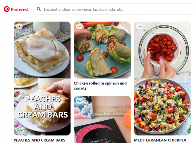
Pinterest Thumbnail Size
Pinterest also allows its users to choose between custom thumbnails or still frames. Although, as with any other social platform, uploading a customized image is always the best alternative.
Pinterest suggests resorting to custom video thumbnails with a 2:3 aspect ratio with a resolution of 1000×1500 pixels ―a suggestion that also applies to regular pins.
You see, thumbnails with a vertical aspect ratio bring a higher engagement rate on this platform than those that are wide or square. So much so that Pinterest now offers a special tool to resize your thumbnail before uploading your video.
So, in the end, Pinterest guidelines are:
- Pinterest Thumbnail Dimensions: 1000×1500 px.
- Aspect Ratio: 2:3 (vertical)
5. How to Make A Thumbnail for YouTube
When you upload a video to YouTube, the platform randomly chooses three freeze-frames from your video to use as a thumbnail and allows you to select one of them. Unfortunately, the YouTube algorithm doesn’t have much of an aesthetic sense. So it usually presents blurry or unappealing images.
No wonder, then, that the greatest thumbnail examples out there are customized. And since we want you to learn how to make a good thumbnail, we’ve put together a list of our five favorite YouTube thumbnail maker tools. So, let’s see how to make a thumbnail for YouTube that impresses your audience!
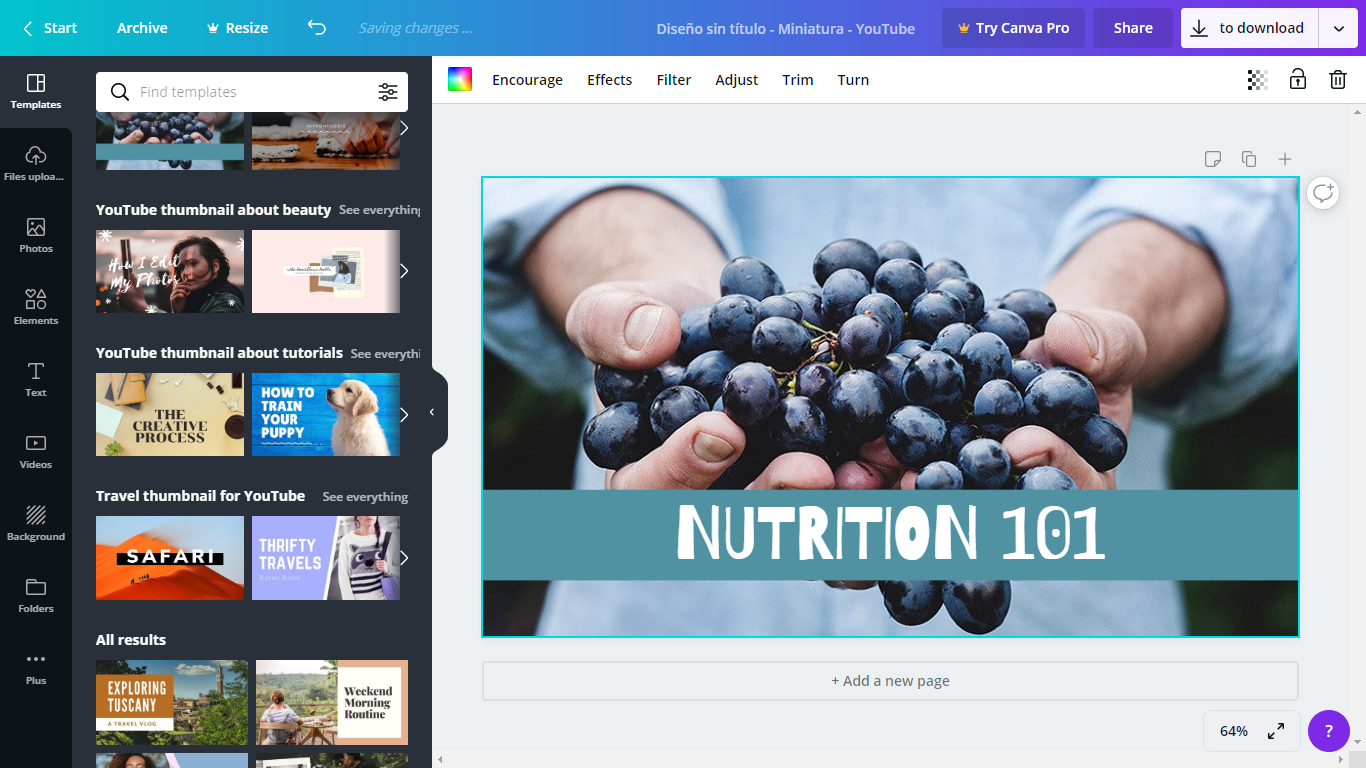
Canva YouTube Thumbnail Maker
If you search the web, you’ll find that Canva is the most recommended tool for making YouTube thumbnails, and it’s not hard to see why.
This YouTube thumbnail maker is incredibly user-friendly, as you can edit anything with just a quick drag and drop. It offers a vast array of templates, stock images, and typefaces, but it also allows you to create a good thumbnail from scratch.
Canva offers a free online service as well as a lot of educational content to help you design better thumbnails. However, you do have to pay to get certain stock images, styles, and templates. For all the rest, all you need to do is register.
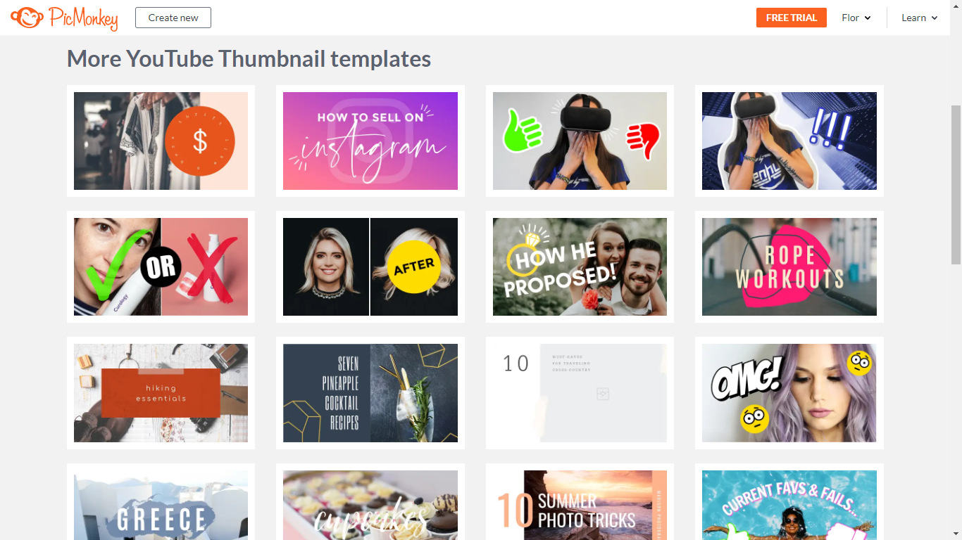
PicMonkey YouTube Thumbnail Maker
PicMonkey is one of the most popular YouTube thumbnail makers, second only to Canva. Both online platforms are quite similar to each other since they are easy to use and offer an ample variety of tools. That said, there are still some differences between them.
First off, PicMonkey provides exclusive effects and overlay options and lets you beautify faces. It also has a broader range of templates than Canva.
Another big difference is that PicMonkey is now a paid service. They do offer a free membership, but it doesn’t allow you to download or share your video thumbnail, which is a major setback.
Adobe Photoshop
For all the Adobe fans out there, this one is a natural choice: the one and only Adobe Photoshop. As one of the top picture editors, this software works wonders for creating good thumbnails.
However, it isn’t recommended for those looking for a fast way to make YouTube thumbnails. Handling this program requires some expertise, and it doesn’t offer templates or stock images. Not to mention, you need to subscribe to an Adobe Creative Cloud plan to get access to it.
Our advice? You have two options. One, if you already have Adobe Photoshop and know how to handle it, go for it. Otherwise, you can rely on third-party assets like the Photoshop actions from Envato Elements or try any of the other YouTube thumbnail maker tools available.
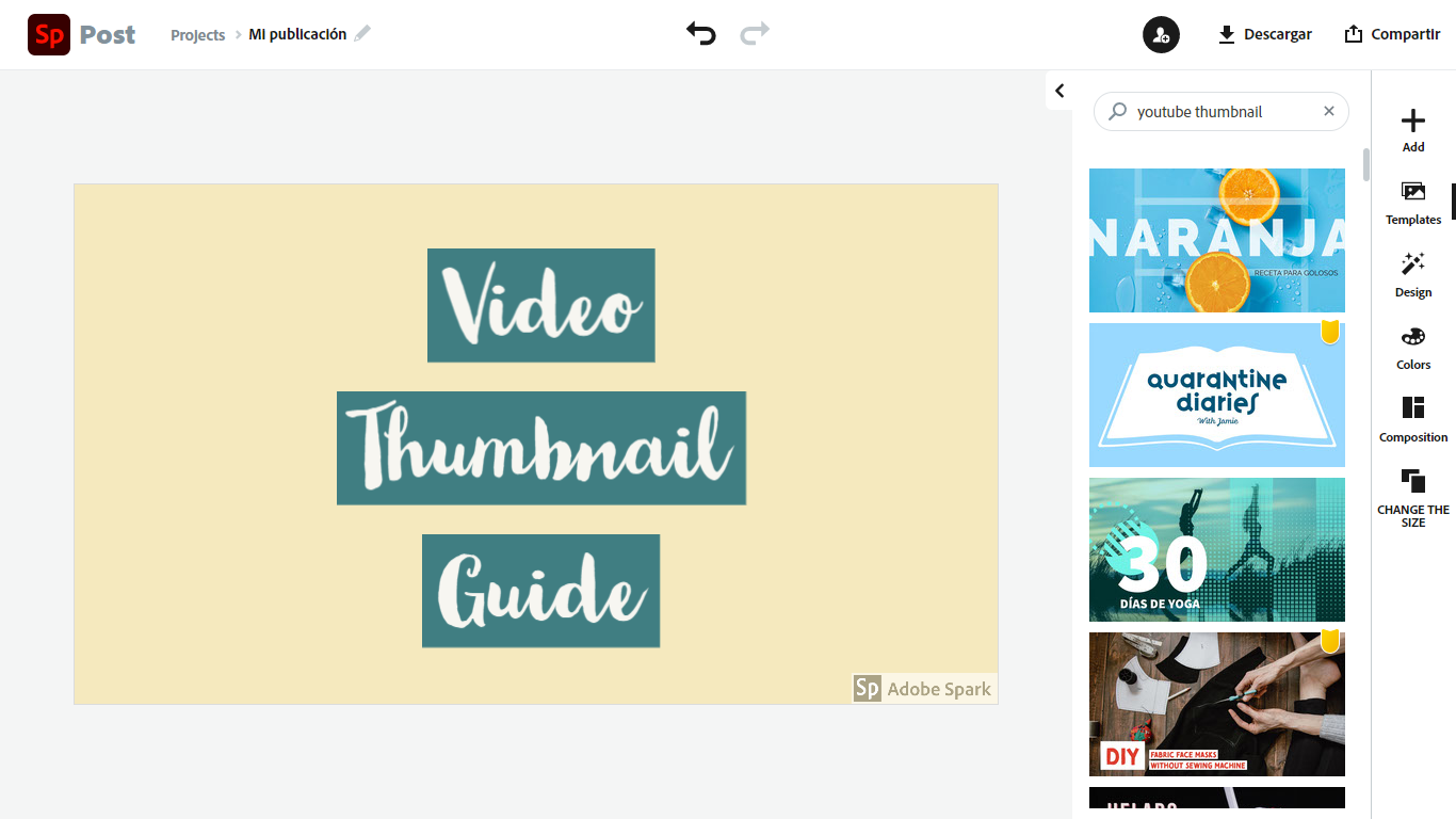
Adobe Spark YouTube Thumbnail Maker
A more user-friendly alternative to Adobe Photoshop is its cousin Adobe Spark. This YouTube thumbnail maker can be used online ― as part of the Creative Cloud plan or as an independent tool ― and as its website puts it, there are “no designer skills needed.”
It offers a free plan with basic features such as high-quality stock images (organized by theme), templates, and fonts, but it also has paid premium memberships for teams or individuals. Through those more sophisticated plans, you can create highly customized video thumbnails and eliminate the Adobe Spark watermark of your projects, among other things.
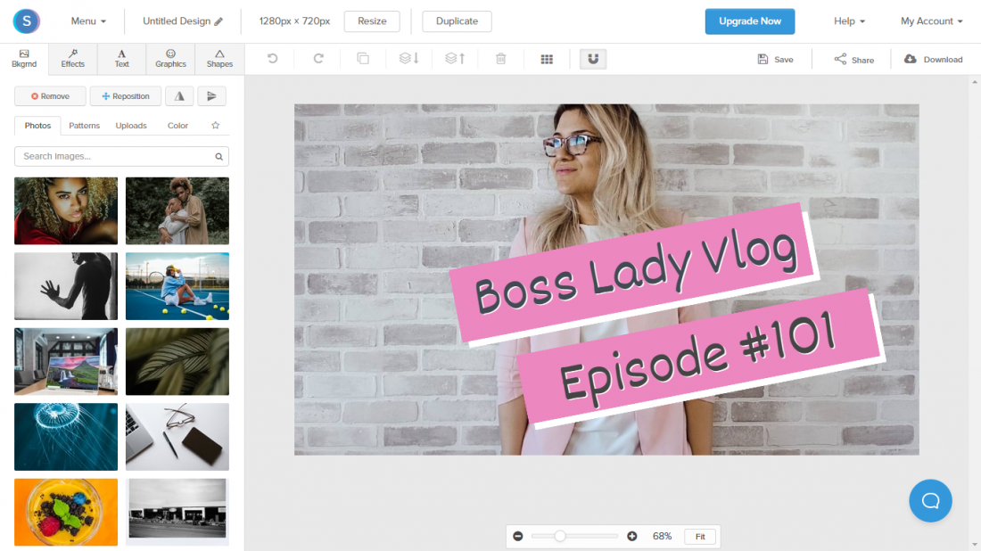
Snappa YouTube Thumbnail Maker
Snappa’s biggest asset must be its extensive library, which has more than six thousand templates and over three million high-definition pictures. Such a wide range of stock images and templates are available on all of their plans (free of charge and premium ones).
This YouTube thumbnail maker it’s definitely easy to handle, but its layout isn’t as intuitive as the ones from other mentioned online platforms.
With a Snappa premium subscription, you can download unlimited video thumbnails (only three downloads per month are allowed on the free membership), remove image backgrounds, and upload your own custom fonts.
6. How to Change a Thumbnail on YouTube
Now that you are familiar with some of the best YouTube thumbnail-maker tools, it’s time you learn how to add a thumbnail to a video on the platform.
But before we start, there’s something important you should bear in mind: Only verified accounts are allowed to upload custom thumbnails to YouTube. Don’t worry, though. Verifying your account is simple and shouldn’t give you much trouble, as the platform only asks for a bit of personal information.
Once that’s taken care of, you are ready to begin.
If you are uploading a video to YouTube, look under the “Thumbnail” section. You’ll see the three still images that the platform offers, and on their left, there’s the option of adding your own thumbnail.
If your video is already published, then it’s a different story. So, let’s see how to change a thumbnail on YouTube:
1. You log in to your YouTube account (I know, duh).
2. You click on your profile image, which is in the upper-right corner.
3. A menu will drop down, and you must select the “YouTube Studio” option.
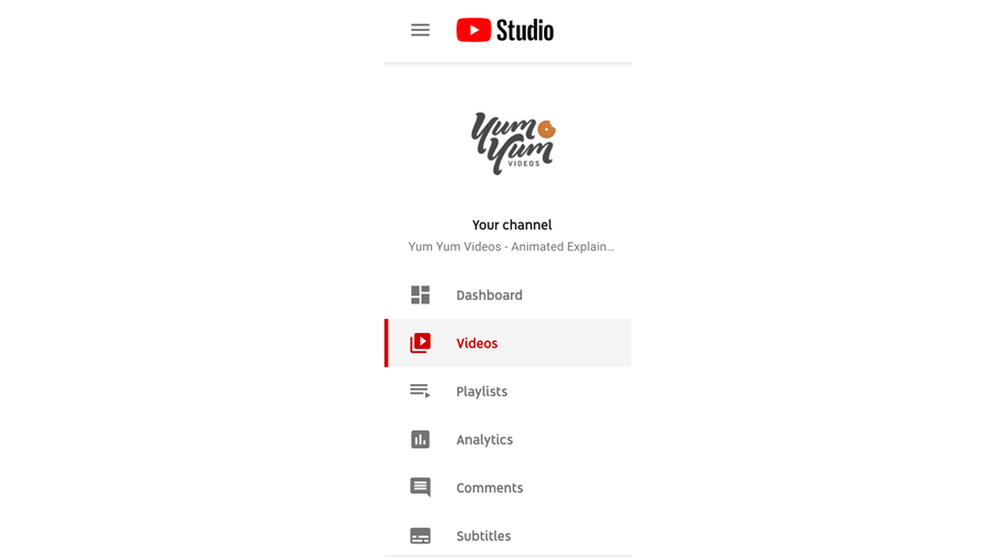
4. See where it says “Videos” on the left column? Click on it.
5. Click on the video whose thumbnail you want to change.
6. Make sure you are on the “Details” section and look where it says “Thumbnail.”
7. Select the “Upload thumbnail” option.
8. Pick an image with the recommended YouTube thumbnail size (1280×720 px).
9. Press “Save” (upper-right side).
And that’s it! You see? It’s not that hard to upload custom thumbnails to YouTube, just make sure you pick a great one!
7. Best Practices: How to Create A Great Video Thumbnail
There’s no one-size-fits-all recipe for making good thumbnails, as everyone offers different content and has a distinct audience. But there are some tips and tricks that can definitely help you make the most out of your thumbnails. Here are some of them!
Go for Simple Images
When you choose an image for your video thumbnail, you should stay away from pictures that are too cluttered or express too much information.
On the contrary, pick an image that can be understood at first glance. Close-up pictures are always a good option in that regard, as they tend to be simple and have fewer details than wider shots.
Moreover, close-ups usually work great with text overlays, avoiding the risk of camouflaging words within a cluttered background.
Use Noticeable Text
It’s said an image is worth a thousand words, but sometimes you need more than that to entice viewers into clicking your video. In those cases, adding a short text to your thumbnail can do the trick.
Take in mind, though, that it’s vital to write in clear, bold, and noticeable text, and avoid using hard-to-read fonts ―sorry, italics fans. Remember that your audience could be seeing your thumbnails on a small screen, so subtle or illegible typefaces can make your video go unnoticed.
Add Color Contrast
As you may have realized, these best practices are all about making your video thumbnail understandable and distinctive. And here’s where color contrast comes in incredibly handy.
So, consider creating thumbnails with a contrast between the subject or object and the background, especially by using bright colors. This tactic will make your subject pop out from the image.
That said, don’t overdo bright colors. Doubly so if they don’t match your audience’s expectations. What I mean is that, if your YouTube channel is about zen life, for example, a soft-background thumbnail may work better for you than a bright-colored one.
Show Facial Expressions
There’s something about facial expressions that can draw people’s attention.
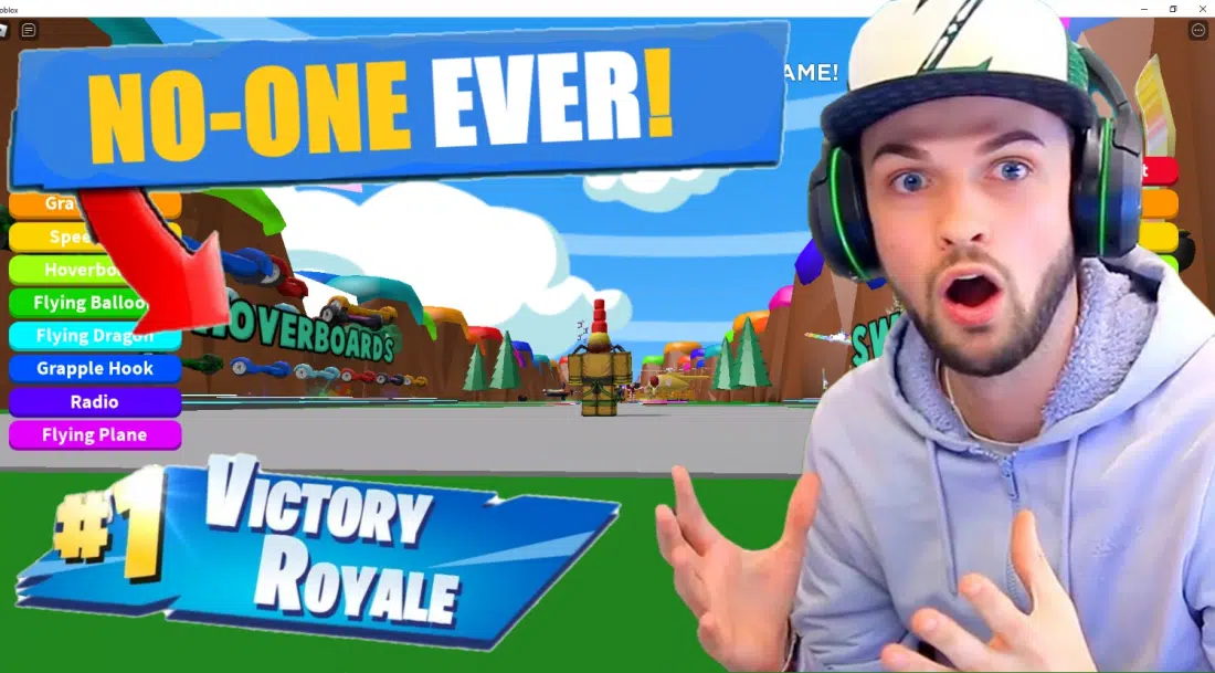
Whether yours is a live-action video or an animated one, you’ll always benefit from including an expressive face in the thumbnail. Doubly so if the face shows an exaggerated expression, such as amazement or fury, and even better if that gesture is intriguing.
However, there are exceptions to this rule. For example, if you offer content related to cooking or gaming, your audience will probably be more interested in seeing a video thumbnail of a finished dish or a game’s graphics rather than a person’s face. You can make YouTube thumbnails combining both elements, though, as long as they don’t look cluttered.
Good Thumbnail Examples to Get Inspired By
We believe that theory is learned better when seen in practice. So, here are some good thumbnail examples that depict some of the best (and worst!) practices you’ve learned today. Take a look!
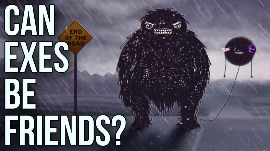
Can Exes Be Friends? – The School of Life
The School of Life is a channel devoted to offering first-rate content to their followers, so it’s no surprise that they sustain that quality standard when they make YouTube thumbnails.
We picked this thumbnail example because it’s simple yet descriptive of the video’s point. Just by taking a quick look at it, one can sense that the channel has a negative take on the title’s question, “Can Exes Be Friends?” ―spoiler alert: they can’t.
Another strength of this thumbnail example is its subtle branding. If you are familiar with this channel, you’ll know that most of its video thumbnails share a similar layout and typeface. That way, The School of Life manages to convey its distinctive style through its thumbnails without including its logo, which can sometimes make such small images look cluttered.
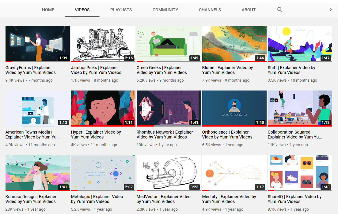
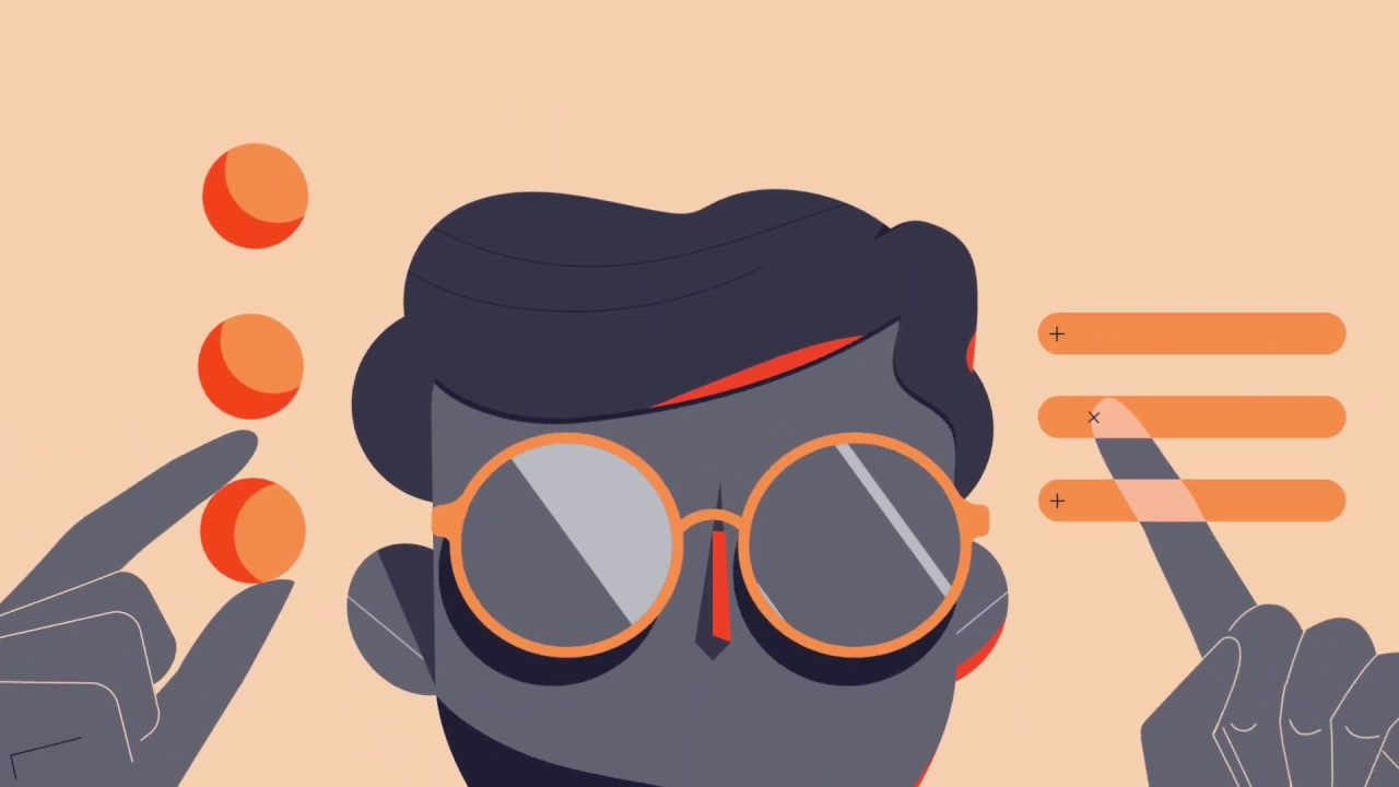
Explainer Video Reel 2020– Yum Yum Videos
Talking about branding, take a look at this thumbnail example:
That thumbnail is part of our latest explainer video reel. Since this video was going to represent our explainer video company this year, we needed a good thumbnail to deeply reflect our brand’s style.
But there was a problem: as this reel was created from bits of corporate videos we made for other businesses, it wasn’t that easy to find a still that conveyed our company’s aesthetic. In the end, we went with this video thumbnail that uses our brand’s color and showcases a high-contrast, attention-grabbing still. A great choice, don’t you think?
It shows the high-quality level of our animations while boasting our brand’s distinctive color palette. Not to mention that it’s a beautiful and simple close-up picture that can instantly draw people’s eyes.
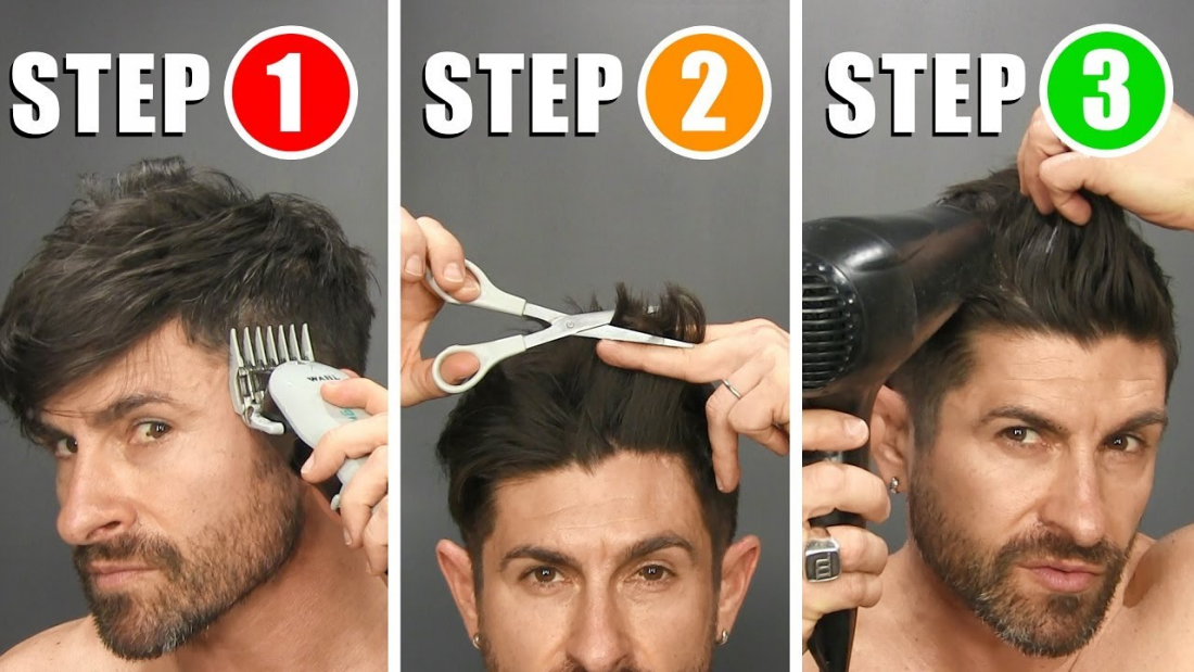
Quick and Easy Home Haircut Tutorial and Tips – Alpha m.
Viewers tend to have a soft spot for videos that offer them practical value. That’s why how-to videos often display their process’ end result or before and after pictures on their thumbnails, but this example shows a different approach.
By showcasing only three steps, this thumbnail example hints the tutorial is “quick and easy,” as the title claims. Since simplicity is this video’s greatest asset, it makes sense that the thumbnail depicts it in order to attract viewers.
It may not seem like something to pay attention to, but you’d be surprised at the enormous amount of how-to videos on the web that don’t boast their practical value on their thumbnails.
There are way too many content creators that, for a similar video, would show a picture of themselves holding a pair of scissors. Don’t get me wrong: that may be a good thumbnail for those YouTubers with celebrity status, but for non-famous content creators, it wouldn’t be nearly as effective as a thumbnail that expresses what the viewer will gain by watching the tutorial.
OrthoScience – Yum Yum Videos
As you’ve (hopefully) learned today, video thumbnails should never look cluttered, as they would be far from being understandable at first glance. So here it’s a good thumbnail example that follows the well-known rule of “less is more”.
It’s a very simple picture, and yet, that’s what makes it stand out! Imagine seeing this thumbnail in YouTube’s suggested video column, probably among other more noisy thumbnails. Don’t you think it may call your attention? After all, it’s undoubtedly easy to look at.
It’s also worth noting that the facial expression is subtle yet incredibly meaningful. This thumbnail example teaches us that there’s no need to go for over-the-top expressions to attract people to your video ―a tactic that, although effective to a point, has been done to death.
Extreme Bedroom Makeover
We’ve gone through some good thumbnail examples you can definitely learn from, but now it’s time to show you a sample of what you shouldn’t do when you make YouTube thumbnails.
We are taking for granted you’ve already learned that blurry images and random freeze-frames are out of the question for any serious brand or content creator. So for this thumbnail example, we’ve chosen a YouTube custom thumbnail that illustrates a less obvious mistake.
Can you tell what’s wrong with this video thumbnail?
It goes against two of the mentioned best practices: noticeable text and color contrast.
Unlike the other thumbnail examples, this one can’t be understood at just a glance (remember it appears on a much smaller scale on YouTube). The white text overlay is hardly seen against the equally clear background. Besides, an inattentive eye can see the before and after pictures as one, as they lack color contrast and a noticeable delimitation.
Let’s Recap!
Can you believe there was so much to learn about such small images? And yet, the more you know about them, the better prepared you are to use them effectively in your video marketing strategy.
Whether you are looking to upload your videos to YouTube, Facebook, IGTV, or any other platform, a good thumbnail ― a.k.a.: a custom thumbnail ― will help you get more people clicking on your content.
As you’ve learned today, you can create amazing video thumbnails without resorting to dirty tricks like click-baiting. You just have to brand your video accordingly and make your thumbnail noticeable and understandable from any screen size, using close-up images, color contrast, and big, bold text overlays, among other things.
So, now that you’ve learned how to make a good thumbnail, roll up those sleeves and start creating awesome images that do justice to your awesome videos 😉

Florencia Oliveto – Content Writer
A skilled writer with a background in audiovisual design. She combines her knowledge of the video production process with a genuine passion for digital marketing. Her goal is to deliver high-value content that’s not only educational but also engaging and easy to understand.

