What Is 2.5D Animation? (And When To Use It!)
18/02/25
Author: Florencia Corazza
12 min reading
Video ProductionMarketing
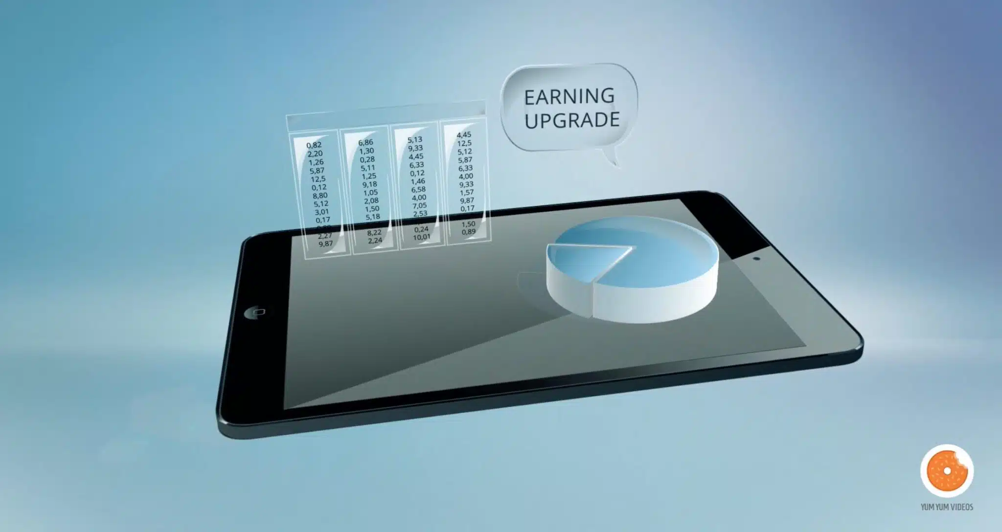
In the world of animation, the term 2.5D animation is often used to describe a unique visual style that blends 2D animation with a sense of depth similar to 3D animation. But what is 2.5D animation, exactly?
This technique creates an illusion of three-dimensional space while still relying on two-dimensional assets. It’s widely used in explainer videos, commercials, video games, and animated presentations, offering a cost-effective alternative to full 3D animation.
In this article, we’ll break down the 2.5D animation style, showcase some 2.5D animation examples, and explain why it has become so popular in modern video production.
Here’s an example of 2.5D animation we created at Yum Yum Videos. Check it out!
What’s the Difference Between 2D, 2.5D, and 3D Animation?
Once you know the answer to the question “What is 2.5D animation?”, you might be wondering about the features that set it apart from other styles. So, here’s a quick summary of the differences between the 2D, 2.5D, and 3D styles and what each of them brings to the table.
- 2D animation: In this type of animation, you’ll have a flat background and flat characters conveying your message. The 2D style is highly effective for captivating your audience through storytelling.
- 2.5D animation: It’s a blend of 2D and 3D animation techniques. You still have a flat background, but your characters and objects look like they’re three-dimensional. This way, the 3D elements become the focal point of attention.
- 3D animation: Out of the three video animation styles I’ve mentioned here, this is the most time-consuming one. The production process of 3D videos involves many more steps, which is why it can offer great character and background depth. But while it might be the most visually appealing animation style, it’s also the most expensive.
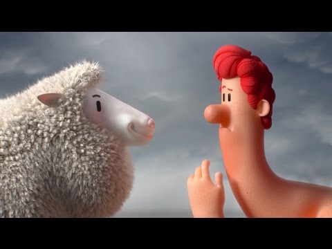
If you want to know a bit more about each of these styles and see what they look like, you can watch this fun video we made about different video styles:
Why Is 2.5D Animation Getting Popular?
Although it’s a somewhat new style when compared traditional ones, 2.5D animation has quickly risen in popularity, and it’s easy to see why! It has the visual allure and depth of 3D pieces, while still being simple enough to remain a fairly budget-friendly option.
It was first made popular through video games and animated shorts and movies, and thanks to the great reception it had with audiences, it was quickly adopted by marketing and video production agencies all around the world.
It’s now also used as an innovative approach to visual storytelling, so it’s the chosen style of those who want to stand out from the crowd and make stunning, memorable videos.
Here’s a video that explains how the acclaimed series Arcane uses 2D backgrounds and 3D characters to save costs, reduce production time, and achieve a stunning visual style. Don’t miss it!
When Should You Consider Using 2.5D Animation?
If you still don’t know which option to pick, let me give you my top 4 reasons why 2.5D is your best choice.
1. To Make Certain Elements Pop
If there’s a specific object or character you want to highlight and use as the star of your video, then 2.5D animation is the way to go. Your piece can be done in 2D, and then suddenly bam! A 3D element appears, instantly becoming the main attraction and stealing the spotlight. This approach is especially useful when you want to promote a product, making it the 3D element that pops out from the flat background.
2. To Highlight Geometric Figures
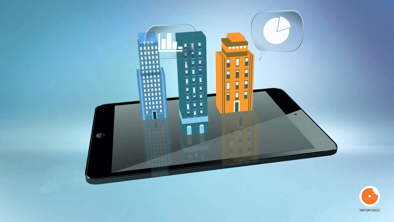
Geometric objects are the most favored elements to include in 2.5D animated pieces, allowing them to be represented in a 3D fashion and stand out from the flat backgrounds. In the examples I listed down below, you’ll see that buildings, electronics, and geometric shapes are present in virtually all scenes because they truly make any video stand out!
3. To Save Time and Money
Whether you’re a startup or don’t have a big budget, you can still leverage this video style to boost your marketing efforts. This type of video poses a budget-friendly alternative to 3D and live-action videos, as it doesn’t require complex software, equipment, or actors (check out our article on animation cost to know more about the topic). Moreover, it’s simpler to make, so you won’t have to wait for ages or go through a complex animation process to get the final piece.
4. To Stand Out from Other Creators
As this animation style is still fairly new, you’ll see that most marketers out there are still opting for only 2D animation —making 2.5D pieces an innovative tool to stand out from the crowd and ensure your video leaves a lasting impression on your audience. It’s a fun and budget-friendly way to create unique content!
10 Best 2.5D Animation Examples
I know, I know — what was meant to be a simple answer to the question “what is 2.5D animation?” became a lot of text and information! Don’t worry; we’ve finally reached the fun part: the examples! Here are five wonderful pieces that can help you better understand what the style looks like and maybe even inspire your next video 😉.
WSP
ChartLam
Cogniz
StockChart
Stocks in Value
Adzerk
Accedian Assurance
TripleBlind
Atlassia
Oracle
1. WSP – A 2.5D Animation by Yum Yum Videos
To start off this list, I’d like to share this fantastic video we made at Yum Yum Videos for our friends at WSP. This business is one of the world’s leading professional services firms, and they trusted our 2D animation company to illustrate their message in this animation style.
I believe this is a perfect example of how 2.5D explainer videos can easily communicate technical or complex topics in a way anyone can understand. The combination of eye-catching animation and smooth transitions will definitely keep the viewer glued to the screen.
Moreover, the visual tone and integration of 2.5D elements gave this video a unique look suitable for all kinds of services, regardless of the industry. Just take a look at how all the buildings and streets are made in a flat 2D design, but positioned in a way that simulates 3D visuals.
Do you need a 2.5D animation video? Contact us for a quote here!
2. ChartLamo — 2.5D Animated Video
Here’s a great example in the medical industry. What I really like about this video is how the animation accentuates the different objects and makes them the piece’s focal point. The result is an elegant style with a distinctive and futuristic look that will make an impact on the viewers’ minds
3. Cognize – 2.5 dimension video
This 2.5D animation is a great example of how color and movement can enhance storytelling. The bright pinkish tones grab attention, while the smooth animations and futuristic illustrations create a modern, engaging look that fits the AI-driven theme of the video.
4. StockChart – A 2.5D Animation by Yum Yum Videos
Here’s one of the videos we created at Yum Yum Videos for StockCharts. This minimalist motion graphics piece was made entirely without characters, relying on clean design and dynamic movement. It features clear examples of 2.5D animation, using geometric shapes like cubes and cylinders that appear to move in three-dimensional space. While everything is technically 2D, the clever layering and perspective tricks create a sense of depth, making elements seem like they’re flying through the camera.
5. Stocks in Value by Yum Yum Videos
.
In this video, a specialist explains key concepts while surrounded by elements that appear to be 3D. However, these are all illustrations, making this a true 2.5D animation video. The design creates an impressive interface that dynamically reinforces the speaker’s message, enhancing the explanation in a creative and futuristic way.
6. Adzerk — Yum Yum Videos
.
You probably noticed that most of this video is in 2D, but pay close attention to the computers, phones, and tables as they move. Those are done in 2.5D animation! The combination results in an engaging piece that is bound to catch viewers’ eyes at exactly the right moment, as the use of 2.5D for specific elements throughout the video makes them stand out from the rest of the animation, making the audience focus on them instantly.
Do you need a 2.5D animation video? Contact us for a quote here!
7. Accedian Assurance — 2.5D Explainer Video
.
Remember what I said about geometric shapes? Look at this amazing example showcasing exactly what I was telling you about! Accedian leverages the visual attraction of these shapes and makes them the focal point of their video, using them as the main characters —notice how there’s no human character! This results in a compelling piece that keeps you hooked until the very end.
8. TripleBlind Two-Minute Overview — 2.5D Video
One of the major challenges businesses face is having to explain who they are and what benefits they bring to the table in a way that compels and catches the attention of audiences. In this case, TripleBlind expertly chose the 2.5D animation style to illustrate a 2-minute overview of their company, ensuring the engaging visuals would make viewers interested in what they have to offer.
9. Atlassian Platform Overview — 2.5D Animation
This video is a great example of using a 2.5D video to highlight just a few of the elements you want to include, giving the piece an interesting look while keeping the overall feeling cohesive with what’s traditional within the industry. Additionally, notice how the 2.5D shapes and objects are used as a way to emphasize what the voiceover is narrating at that point!
10. What Is Oracle Customer Success Services? — 2.5D Video
Last, but certainly not least, let’s take a look at this animated explainer. What I loved about it is that the only 2.5D element they included is precisely the most important one: a box that represents the company’s cloud-based solution —not only making an abstract concept into a concrete one, but also making it the star of the video thanks to the animation style that differentiates it from all other objects and backgrounds in the video.
Need a 2.5D Animation Video? Here’s How We Can Help!
Being in the industry for over a decade now has allowed us to put together a professional team with the skills and passion to produce fully customized, effective videos that can bring your message to life.
Do you want to know our secret? 😉 A solid compromise for genuinely listening to our client’s needs and goals.
With your marketing objectives as the compass to guide our process, we tailor-make each and every piece we work on so they fit your brand and your tone perfectly. No matter what niche you operate in, our unique videos can help you tackle even the most complex or abstract concepts to effectively convey your message.
At Yum Yum Videos, our passion and dedication drive our work. We love what we do, and we make sure our videos show it 😃. So, if you’re ready to get that awesome video for your company, send us a message, and let’s talk about it!
Final Thoughts
I hope this article has helped you better understand what 2.5D animation is and whether it’s the right fit for your project. If you’ve worked with 2D or 3D animation before, exploring 2.5D animation style can be a great next step—especially for industries like tech, finance, and healthcare, where engaging visuals are key.
The 2.5D animation examples shared here can serve as inspiration, but the possibilities are endless! Whether you experiment with this style on your own or work with a professional studio, there are many talented animation companies worldwide that can bring your vision to life.

Florencia Corazza – Content Writer and Co-Editor
A skilled writer, translator, and co-editor for our web and blog content. As a self-defined "wordsmith," she’s talented in adapting the latest marketing news into all kinds of digital formats. If she’s not watching the latest Sci-Fi show on Netflix, then can find her tending to her perfectly reasonable number of plants.


